Showing posts with label pylab. Show all posts

Saturday, January 14, 2012

How to plot a function of two variables with matplotlib

In this post we will see how to visualize a function of two variables in two ways. First, we will create an intensity image of the function and, second, we will use the 3D plotting capabilities of matplotlib to create a shaded surface plot. So, let's go with the code:
from numpy import exp,arange
from pylab import meshgrid,cm,imshow,contour,clabel,colorbar,axis,title,show

# the function that I'm going to plot
def z_func(x,y):
 return (1-(x**2+y**3))*exp(-(x**2+y**2)/2)
 
x = arange(-3.0,3.0,0.1)
y = arange(-3.0,3.0,0.1)
X,Y = meshgrid(x, y) # grid of point
Z = z_func(X, Y) # evaluation of the function on the grid

im = imshow(Z,cmap=cm.RdBu) # drawing the function
# adding the Contour lines with labels
cset = contour(Z,arange(-1,1.5,0.2),linewidths=2,cmap=cm.Set2)
clabel(cset,inline=True,fmt='%1.1f',fontsize=10)
colorbar(im) # adding the colobar on the right
# latex fashion title
title('$z=(1-x^2+y^3) e^{-(x^2+y^2)/2}$')
show()
The script would have the following output:


And now we are going to use the values stored in X,Y and Z to make a 3D plot using the mplot3d toolkit. Here's the snippet:
from mpl_toolkits.mplot3d import Axes3D
from matplotlib import cm
from matplotlib.ticker import LinearLocator, FormatStrFormatter
import matplotlib.pyplot as plt

fig = plt.figure()
ax = fig.gca(projection='3d')
surf = ax.plot_surface(X, Y, Z, rstride=1, cstride=1, 
                      cmap=cm.RdBu,linewidth=0, antialiased=False)

ax.zaxis.set_major_locator(LinearLocator(10))
ax.zaxis.set_major_formatter(FormatStrFormatter('%.02f'))

fig.colorbar(surf, shrink=0.5, aspect=5)

plt.show()
And this is the result:

Thursday, December 15, 2011

Polar Charts with matplolib

A polar system is a two-dimensional coordinate system, where there are two coordinates: the radial and the angular coordinates. The radial coordinate denotes the point distance from a central point (pole) and the angular coordinate denotes the angle required to reach the point from the 0 degree ray (polar axis). Let's see an example of how to make polar charts with matplotlib:
from pylab import figure,polar,show
from numpy import arange,pi,cos

theta = arange(0, 2, 1./180)*pi # angular coordinates
figure(1)
polar(3*theta, theta/5) # drawing a spiral
figure(2)
polar(theta, cos(4*theta)) # drawing the polar rose
show()
The result of this script consists of two charts. The first with the spiral
and the second with the polar rose

Thursday, December 8, 2011

Lissajous curves

And after the Epitrochoids, we're going to see another family of wonderful figures: The Lissajous curves. The equations that describe these curves are the following


the curves vary with respect the parameter t and their appearance is determined by the ratio a/b and the value of δ.
As usual, I made a snippet to visualize them:
from numpy import sin,pi,linspace
from pylab import plot,show,subplot

a = [1,3,5,3] # plotting the curves for
b = [1,5,7,4] # different values of a/b
delta = pi/2
t = linspace(-pi,pi,300)

for i in range(0,4):
 x = sin(a[i] * t + delta)
 y = sin(b[i] * t)
 subplot(2,2,i+1)
 plot(x,y)

show()
This is the result

Wednesday, September 14, 2011

Uncertainty principle and spectrogram with pylab

The Fourier transform does not give any information on the time at which a frequency component occurs. One approach which can give information on the time resolution of the spectrum is the Short Time Fourier Transform (STFT). Here a moving window is applied to the signal and the Fourier transform is applied to the signal within the window as the window is moved [Ref]. The choice of window is very important with respect to the performance of the STFT in practice. Since the STFT is simply applying the Fourier transform to pieces of the time series of interest, a drawback of the STFT is that it will not be able to resolve events if they happen to appear within the width of the window. In this case, the lack of time resolution of the Fourier transform is present. In general, one cannot achieve simultaneous time and frequency resolution because of the Heisenberg uncertain principle. In the field of particle physics, an elementary particle does not have precise position and momentum. The better one determines the position of the particle, the less precisely is know at that time, and vice versa. For signal processing, this rule translates into the fact that a signal does not simultaneously have a precise location in time and precise frequency [Ref].

The library pylab provides the function specgram(...) to compute the spectrogram of a signal using the STFT. The following script uses that function to show the spectrogram of a signal with different windows size:
from scipy.io.wavfile import read,write
from pylab import plot,show,subplot,specgram

# Open the Homer Simpson voice: "Ummm, Crumbled up cookie things."
# from http://www.thesoundarchive.com/simpsons/homer/mcrumble.wav
rate,data = read('mcrumble.wav') # reading

subplot(411)
plot(range(len(data)),data)
subplot(412)
# NFFT is the number of data points used in each block for the FFT
# and noverlap is the number of points of overlap between blocks
specgram(data, NFFT=128, noverlap=0) # small window
subplot(413)
specgram(data, NFFT=512, noverlap=0) 
subplot(414)
specgram(data, NFFT=1024, noverlap=0) # big window

show()
This image is the result:
The pictures shows that changing the number of data points used for each Fourier transform block, the spectrogram loses definition in frequency or in the time.

Thursday, August 25, 2011

How to use ginput

ginput is a function that enables you to select points from a figure using the mouse. This post is a simple example on how to use it.
from pylab import plot, ginput, show, axis

axis([-1, 1, -1, 1])
print "Please click three times"
pts = ginput(3) # it will wait for three clicks
print "The point selected are"
print pts # ginput returns points as tuples
x=map(lambda x: x[0],pts) # map applies the function passed as 
y=map(lambda x: x[1],pts) # first parameter to each element of pts
plot(x,y,'-o')
axis([-1, 1, -1, 1])
show()
And after three clicks this is the result on the console:
Please click three times
The point selected are
[(-0.77468982630272942, -0.3418367346938776), (0.11464019851116632, -0.21428571428571436), (0.420347394540943, 0.55612244897959173)]
and this is the figure generated:


Tuesday, July 12, 2011

Dice rolling experiment

If we roll a die a large number of times, and we compute the mean and variance, as exaplained here, we’d expect to obtain a mean = 3.5 and a variance = 2.916. Let's simulate that with a script:
import pylab
import math
 
# Rolling the die 1000 times
v = pylab.randint(1,7,size=(1000))

print 'mean',pylab.mean(v)
print 'variance',pylab.var(v)

pylab.hist(v, bins=6) # histogram of the outcoming
pylab.xlim(1,6)
pylab.show()
Here's the result:
mean 3.435
variance 2.781775

Monday, July 4, 2011

How to plot biorhythm

The following script plot the biorhythm of a person born in 14/3/1988 in a range of 20 days.
from datetime import date
import matplotlib.dates
from pylab import *
from numpy import array,sin,pi

t0 = date(1988,3,14).toordinal()
t1 = date.today().toordinal()
t = array(range((t1-10),(t1+10))) # range of 20 days

y = 100*[sin(2*pi*(t-t0)/23),  # Physical
         sin(2*pi*(t-t0)/28),  # Emotional
         sin(2*pi*(t-t0)/33)]; # Intellectual

# converting ordinals to date
label = []
for p in t:
 label.append(date.fromordinal(p))

fig = figure()
ax = fig.gca()
plot(label,y[0],label,y[1],label,y[2])
# adding a legend
legend(['Physical', 'Emotional', 'Intellectual'])
# formatting the dates on the x axis
ax.xaxis.set_major_formatter(matplotlib.dates.DateFormatter('%d/%b'))

show()
The resulting graph:

Thursday, June 30, 2011

Animation with matplotlib, bringin the Sierpinski triangle to life

Few post ago we have seen how to plot the Sierpinski triangle. This post is an update that shows how to create an animation where at each step a new point of the fractal is plotted:
from numpy import *
import pylab

x = [0, 0];

A = [ [.5, 0], [0, .5] ];
b1 = [0, 0];
b2 = [.5, 0];
b3 = [.25, sqrt(3)/4];

pylab.ion() # animation on

#Note the comma after line. This is placed here because plot returns a list of lines that are drawn.
line, = pylab.plot(x[0],x[1],'m.',markersize=6) 
pylab.axis([0,1,0,1])

data1 = []
data2 = []
iter = 0

while True:
 r = fix(random.rand()*3)
 if r==0:
  x = dot(A,x)+b1
 if r==1:
  x = dot(A,x)+b2
 if r==2:
  x = dot(A,x)+b3
 data1.append(x[0]) 
 data2.append(x[1])
 line.set_xdata(data1)  # update the data
 line.set_ydata(data2)
 pylab.draw() # draw the points again
 iter += 1
 print iter
This is the result:

Friday, June 3, 2011

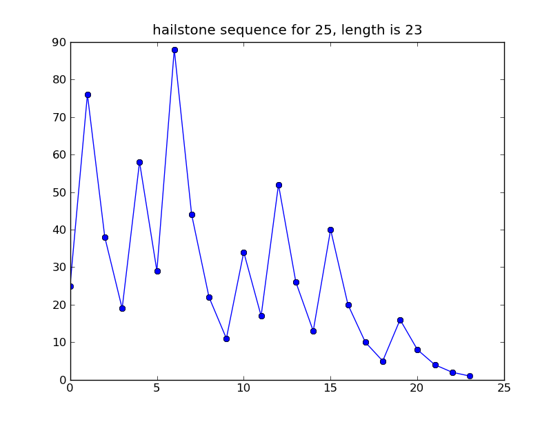
The Collatz conjecture

The Collatz conjecture is a famous unsolved problem in number theory. Start with any
positive integer n. Repeat the following steps:
  • If n = 1, stop.
  • If n is even, replace it with n/2.
  • If n is odd, replace it with 3n + 1

The unanswered question is, does the process always terminate?

Let to see a script that generate the sequence of number involved by the algorithm:

import sys
from pylab import *

# take n from the command line
n = int(sys.argv[1])

i = 0
old_n = n
while n > 1:
 if n%2 == 0: # if n is even
  n = n/2
 else:
  n = 3*n+1
 i += 1;
 plot([i-1, i],[old_n,n],'-ob')
 old_n = n

title('hailstone sequence for '+sys.argv[1]+', length is '+str(i))
show()
The script will plot the sequence:
$ python collatz.py 25

The Collatz conjecture is is also known as the 3n + 1 conjecture, the Ulam conjecture, Kakutani's problem, the Thwaites conjecture, Hasse's algorithm, or the Syracuse problem; the sequence of numbers involved is referred to as the hailstone sequence or hailstone numbers, or as wondrous numbers.

References

Wednesday, April 27, 2011

How to find the minimum of a function using fmin from scipy

In this example we will see how to use the function fmin to minimize a function. The function fmin is contained in the optimize module of the scipy library. It uses the downhill simplex algorithm to find the minimum of an objective function starting from a guessing point given by the user. In the example we will start from two different guessing points to compare the results. Here's the code:
import numpy
import pylab
from scipy.optimize import fmin

# objective function
rsinc = lambda x: -1 * numpy.sin(x)/x

x0 = -5 # start from x = -5
xmin0 = fmin(rsinc,x0)

x1 = -4 # start from x = -4
xmin1 = fmin(rsinc,x1)

# plot the function
x = numpy.linspace(-15,15,100)
y = rsinc(x)
pylab.plot(x,y)
# plot of x0 and the minimum found startin from x0
pylab.plot(x0,rsinc(x0),'bd',xmin0,rsinc(xmin0),'bo')
# plot of x1 and the minimum found startin from x1
pylab.plot(x1,rsinc(x1),'rd',xmin1,rsinc(xmin1),'ro')
pylab.axis([-15,15,-1.3,0.3])
pylab.show()
The function fmin will print some detail about the iterative process performed:
Optimization terminated successfully.
         Current function value: -0.128375
         Iterations: 18
         Function evaluations: 36
Optimization terminated successfully.
         Current function value: -1.000000
         Iterations: 19
         Function evaluations: 38

And the graphical result should be as follows:


The blue dot is the minimum found starting from the blue diamond (x=-5) and the red dot is the minimum found starting from the red diamond (x=-4). In this case, when we start from x=-5 fmin get stuck in a local minum and when we start from x=-4 fmin reaches the global minimum.

Tuesday, April 26, 2011

How to plot a function using matplotlib

We will see how to evaluate a function using numpy and how to plot the result.
import pylab
import numpy

x = numpy.linspace(-15,15,100) # 100 linearly spaced numbers
y = numpy.sin(x)/x # computing the values of sin(x)/x

# compose plot
pylab.plot(x,y) # sin(x)/x
pylab.plot(x,y,'co') # same function with cyan dots
pylab.plot(x,2*y,x,3*y) # 2*sin(x)/x and 3*sin(x)/x
pylab.show() # show the plot
The command pylab.show() will open a window with the following plot: