Friday, June 4, 2021

The Central Limit Theorem, a hands-on introduction

The central limit theorem can be informally summarized in few words: The sum of x1, x2, ... xn samples from the same distribution is normally distributed, provided that n is big enough and that the distribution has a finite variance. to show this in an experimental way, let's define a function that sums n samples from the same distrubution for 100000 times:
import numpy as np
import scipy.stats as sps
import matplotlib.pyplot as plt

def sum_random_variables(*kwarg, sp_distribution, n):
    # returns the sum of n random samples
    # drawn from sp_distribution
    v = [sp_distribution.rvs(*kwarg, size=100000) for _ in range(n)]
    return np.sum(v, axis=0)
This function takes in input the parameters of the distrubution, the function that implements the distrubution and n. It returns an array of 100000 elements, where each element is the sum of n samples. Given the Central Limit Theorem, we expect that the values in output are normally distributed if n is big enough. To verify this, let's consider a beta distribution with parameters alpha=1 and beta=2, run our function increasing n and plot the histogram of the values in output:
plt.figure(figsize=(9, 3))
N = 5
for n in range(1, N):
    plt.subplot(1, N-1, n)
    s = sum_random_variables(1, 2, sp_distribution=sps.beta, n=n)
    plt.hist(s, density=True)
plt.tight_layout()
On the far left we have the histogram with n=1 , the one with n=2 right next to it, and so on until n=4. With n=1 we have the original distribution, which is heavily skewed. With n=2 we have a distribution which is less skewed. When we reach n=4 we see that the distribution is almost symmetrical, resembling a normal distribution.

Let's do the same experiment using a uniform distribution:
plt.figure(figsize=(9, 3))
for n in range(1, N):
    plt.subplot(1, N-1, n)
    s = sum_random_variables(1, 1, sp_distribution=sps.beta, n=n)
    plt.hist(s, density=True)
plt.tight_layout()
Here we have that for n=2 the distribution is already symmetrical, resembling a triangle, and increasing n further we get closer to the shape of a Gaussian.

The same behaviour can be shown for discrete distributions. Here's what happens if we use the Bernoulli distribution:
plt.figure(figsize=(9, 3))
for n in range(1, N):
    plt.subplot(1, N-1, n)
    s = sum_random_variables(.5, sp_distribution=sps.bernoulli, n=n)
    plt.hist(s, bins=n+1, density=True, rwidth=.7)
plt.tight_layout()
We see again that for n=2 the distribution starts to be symmetrical and that the shape of a Gaussian is almost clear for n=4.

Wednesday, April 7, 2021

A Simple model that earned a Silver medal in predicting the results of the NCAAW tournament

This year I decided to join the March Machine Learning Mania 2021 - NCAAW challenge on Kaggle. It proposes to predict the outcome of each game into the basketball NCAAW tournament, which is a tournament for women at college level. Participants can assign a probability to each outcome and they're ranked on the leaderboard according to the accuracy of their prediction. One of the most attractive elements of the challenge is that the leaderboard is updated after each game throughout the tournament.

Since I have limited knowledge of basketball I decided to use a minimalistic model:
  • It uses three features that are easy to interpret: seed, percentage of victories, and the average score of each team.
  • It is based on linear Linear Regression, and it's tuned to predict extreme probability values only for games that are easy to predict.
The following visualizations give insight into how the model estimates the winning probability in a game between two teams:

Surprisingly, this model ranked 46th out of 451 submissions, placing itself in the top 11% of the leaderboard and earning a silver medal!

The notebook with the solution and some more charts can be found here.

Wednesday, November 11, 2020

Visualize the Dictionary of Obscure Words with T-SNE

I recently published on a wrapper around The Dictionary of Obscure Words (originally from this website http://phrontistery.info) for Python and in this post we'll see how to create a visualization to highlight few entries from the dictionary using the dimensionality reduction technique called T-SNE. The dictionary is available on github at this address https://github.com/JustGlowing/obscure_words and can be installed as follows:
pip install git+https://github.com/JustGlowing/obscure_words
We can now import the dictionary and create a vectorial representation of each word:
import matplotlib.pyplot as plt
import numpy as np
from obscure_words import load_obscure_words
from sklearn.feature_extraction.text import TfidfVectorizer, CountVectorizer
from sklearn.manifold import TSNE

obscure_dict = load_obscure_words()
words = np.array(list(obscure_dict.keys()))
definitions = np.array(list(obscure_dict.values()))

vectorizer = TfidfVectorizer(stop_words=None)
X = vectorizer.fit_transform(definitions)

projector = TSNE(random_state=0)
XX = projector.fit_transform(X)
In the snippet above, we compute a Tf-Idf representation using the definition of each word. This gives us a vector for each word in our dictionary, but each of these vectors has many elements as the total number of words used in all the definitions. Since we can't plot all the features extracted, we reduce our data to 2 dimensions we use T-SNE. We have now a mapping that allows us to place each word in a point of a bi-dimensional space. There's one problem remaining, how can we plot the words in a way that we can still read them? Here's a solution:
from sklearn.cluster import KMeans
from sklearn.preprocessing import StandardScaler
from sklearn.metrics import pairwise_distances

def textscatter(x, y, text, k=10):
    X = np.array([x, y]).T
    clustering = KMeans(n_clusters=k)
    scaler = StandardScaler()
    clustering.fit(scaler.fit_transform(X))
    centers = scaler.inverse_transform(clustering.cluster_centers_)
    selected = np.argmin(pairwise_distances(X, centers), axis=0)
    plt.scatter(x, y, s=6, c=clustering.predict(scaler.transform(X)), alpha=.05)
    for i in selected:
        plt.text(x[i], y[i], text[i], fontsize=10)

plt.figure(figsize=(16, 16))
textscatter(XX[:, 0], XX[:, 1], 
            [w+'\n'+d for w, d in zip(words, definitions)], 20)
plt.show()
In the function textscatter we segment all the points created at the previous steps in k clusters using K-Means, then we plot the word related to the center of cluster (and also its definion). Given the properties of K-Means we know that the centers are distant from each other and with the right choice of k we can maximize the number of words we can display. This is the result of the snippet above:
(click on the figure to see the entire chart)

Monday, June 29, 2020

Solving the Travelling Salesman Problem with MiniSom

Have you ever heard of the Travelling Salesman Problem? I'm pretty sure you do, but let's refresh our mind looking at its formulation: "Given a list of points and the distances between each pair of points, what is the shortest possible path that visits each point and returns to the starting point?".
What makes this problem so famous and so studied is the fact that it has no "quick" solution as the complexity of calculating the best path increases adding more points. And the complexity increases so fast that, even with modern hardware, it can be impossible to compute an exact solution in a reasonable time. In more rigorous terms, it is an NP-hard problem. Many heuristics are known to solve this problem and in this post we will see a solution based on Self-organizing Maps (SOM). A SOM is a Neural Network that is capable of mapping an input point into a bi-dimnsional space placing points that are close to each other into the same area. Hence, the idea to solve our problem is to train the SOM in order to map the points to visit in single dimension map and visit the points from the one mapped to the first cell (the one on the left) to the last cell (on the right). Points that are mapped to the same cell are visited consecutively.


Let's generate a set of points to test this idea:
import numpy as np
import matplotlib.pyplot as plt

np.random.RandomState(10)
N_points = 20
N_neurons = N_points*2
t = np.linspace(0, np.pi*2, N_points)
x = np.cos(t)+(np.random.rand(N_points)-.5)*.3
y = np.sin(t)*.8+(np.random.rand(N_points)-.5)*.2
points = np.array([x,y]).T
plt.scatter(x, y)


We can now import MiniSom, our favorite implementation of the Self_Organizing Maps, and see what path it's able to produce:
from minisom import MiniSom

som = MiniSom(1, N_neurons*2, 2, sigma=10,
              neighborhood_function='gaussian', random_seed=50)
max_iter = 2000
som.pca_weights_init(points)

paths_x = []
paths_y = []
for i in np.arange(max_iter):
    i_point = i % len(points)
    som.update(points[i_point], som.winner(points[i_point]), i, max_iter)
    visit_order = np.argsort([som.winner(p)[1] for p in points])
    visit_order = np.concatenate((visit_order, [visit_order[0]]))
    paths_x.append(points[visit_order][:,0])
    paths_y.append(points[visit_order][:,1])
    
plt.scatter(x, y, label='point to visit')
plt.plot(paths_x[-1], paths_y[-1],
         'C3', linewidth=2, label='path')


In the snippet above we initialized the SOM and run 2000 training iterations (check this out to discover how that works). At each iteration we have saved the path found and visualized the last solution. As we can see, the line covers all the points and it's easy to see that it's the best possible path with just a glance. However, it's interesting to see how the solution evolves at each iteration:
from matplotlib.animation import FuncAnimation
from IPython.display import HTML

fig, ax = plt.subplots()
plt.scatter(x, y, label='point to visit')
ln, = plt.plot([], [], 'C3', linewidth=2, label='path')
plt.legend()

def update(frame):
    ln.set_data(paths_x[frame], paths_y[frame])
    plt.title('iteration = %d' % frame)
    return ln,

ani = FuncAnimation(fig, update, frames=np.arange(max_iter),
                    interval=10, repeat=False, blit=False)
HTML(ani.to_html5_video())


Here we note that the initial path is very messy and presents various loops and that the more the network is trained the more optimal the solution becomes. Notice that the snippet above uses the object HTML from the IPython library and it will automatically display the video if a Jupyter notebook is used. The video can be saved in a specific location using ani.save(filename.mp4).

Sunday, May 17, 2020

Neural Networks Regularization made easy with sklearn and matplotlib

Using regularization has many benefits, the most common are reduction of overfitting and solving multicollinearity issues. All of this is covered very well in literature, especially in (Hastie et all). Howerver, wihout touching too many details we can have a very straigthforward interpretation of regularization. Regularization is a way to constrain a model in order to learn less from the data. In this post we will experimentally show what are the effects of regularization on a Neural Network (Multilayer Perceptron) validating this interpretation.

Let's define a goal for our Neural Network. We have a dataset H and we want to build a model able to reconstruct the same data. More formally, we want to build a function f that takes in input H and returns the same values or an approximation close as possible to H. We can say that we want f to minimize the following error


To begin our experiment we build a data matrix H that contains the coordinate of a stylized star:
import numpy as np
import matplotlib.pyplot as plt
%matplotlib inline

x= [np.cos(np.pi/2), 2/5*np.cos(np.pi/2+np.pi/5), np.cos(np.pi/2+2*np.pi/5), 
    2/5*np.cos(np.pi/2+3*np.pi/5), np.cos(np.pi/2+4*np.pi/5), 
    2/5*np.cos(3*np.pi/2), np.cos(np.pi/2+6*np.pi/5), 
    2/5*np.cos(np.pi/2+7*np.pi/5), np.cos(np.pi/2+8*np.pi/5),
    2/5*np.cos(np.pi/2+9*np.pi/5), np.cos(np.pi/2)]

y=[np.sin(np.pi/2), 2/5*np.sin(np.pi/2+np.pi/5), np.sin(np.pi/2+2*np.pi/5),
   2/5*np.sin(np.pi/2+3*np.pi/5), np.sin(np.pi/2+4*np.pi/5),
   2/5*np.sin(3*np.pi/2), np.sin(np.pi/2+6*np.pi/5),
   2/5*np.sin(np.pi/2+7*np.pi/5), np.sin(np.pi/2+8*np.pi/5),
   2/5*np.sin(np.pi/2+9*np.pi/5), np.sin(np.pi/2)]

xp = np.linspace(0, 1, len(x))
np.interp(2.5, xp, x)
x = np.log(np.interp(np.linspace(0, 1, len(x)*10), xp, x)+1)

yp = np.linspace(0, 1, len(y))
np.interp(2.5, yp, y)
y = np.interp(np.linspace(0, 1, len(y)*10), yp, y)
#y[::2] += .1

H = np.array([x, y]).T
plt.plot(H[:,0], H[:,1], '-o')


Now the matrix H contains the x coordinates of our star in the first column and the y coordinates in the second. With the help of sklearn, we can now train a Neural Network and plot the result:
from sklearn.neural_network import MLPRegressor
from sklearn.preprocessing import minmax_scale

H = scale(H)

plt.figure()
f = MLPRegressor(hidden_layer_sizes=(200, 200, 200), alpha=0)
f.fit(H, H)
result = f.predict(H)
plt.plot(result[:,0], result[:,1], 'C3', linewidth=3, label='Neural Network')
plt.plot(H[:,0], H[:,1], 'o', alpha=.3, label='original')
plt.legend()
#plt.xlim([-0.1, 1.1])
#plt.ylim([-0.1, 1.1])
plt.show()


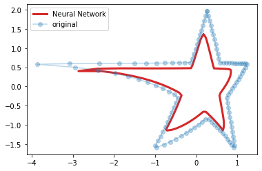
In the snippet above we created a Neural Network with 3 layers of 200 neurons. Then, we trained the model using H as both input and output data. In the chart we compare the original data with the estimation. It's easy to see that there are small differences between the two stars but they are very close.
Here's important to notice that we initialized MLPRegressor using alpha=0. This parameter controls the regularization of the model and the higher its value, the more regularization we apply. To understand how alpha affects the learning of the model we need to add a term to the computation of the error that was just introduced:


where W is a matrix of all the weights in the network. The error not only takes in account the difference between the ouput of the function and the data, but also the size of weights of the connections of the network. Hence, the higher alpha, the less the model is free to learn. If we set alpha to 20 in our experiment we have the following result:


We still achie an approximation of the star but the output of our model is smaller than before and the edges of the star are smoother.
Increasing alpha gradually is a good way to understand the effects of regularization:
from matplotlib.animation import FuncAnimation
from IPython.display import HTML

fig, ax = plt.subplots()
ln, = plt.plot([], [], 'C3', linewidth=3, label='Neural Network')
plt.plot(H[:,0], H[:,1], 'o', alpha=.3, label='original')
plt.legend()

def update(frame):
    f = MLPRegressor(hidden_layer_sizes=(200, 200, 200), alpha=frame)
    f.fit(H, H)
    result = f.predict(H)
    ln.set_data(result[:,0], result[:,1])
    plt.title('alpha = %.2f' % frame)
    return ln,

ani = FuncAnimation(fig, update, frames=np.linspace(0, 40, 100), blit=True)
HTML(ani.to_html5_video())


Here we vary alpha from 0 to 40 and plot the result for each value. We notice here that not only the star gets smaller and smoother as alpha increases but also that the network tends to preserve long lines as much as possible getting away from the edges which account less on error function. Finally we see that the result degenerates into a point when alpha is too high.

Friday, May 1, 2020

Tornado plots with matplotlib

Lately there's a bit of attention about charts where the values of a time series are plotted against the change point by point. This thanks to this rather colorful and cluttered Tornado plot.

In this post we will see how to make one of those charts with our favorite plotting library, matplotlib, and we'll also try to understand how to read them.
Let's start loading the records of the concentration of CO2 in the atmosphere and aggregate the values on month level. After that we can plot straight away the value of the concentration against the change compared to the previous month:
import pandas as pd
import matplotlib.pyplot as plt
%matplotlib inline

data_url = 'ftp://aftp.cmdl.noaa.gov/products/trends/co2/co2_weekly_mlo.txt'
co2_data = pd.read_csv(data_url, sep='\s+', comment='#', na_values=-999.99,
                       names=['year', 'month', 'day', 'decimal', 'ppm', 
                       'days', '1_yr_ago',  '10_yr_ago', 'since_1800'])
co2_data = co2_data.groupby([co2_data.year, co2_data.month]).mean()
idx = co2_data.index.to_flat_index()
co2_data['timestamp'] = [pd.Timestamp(year=y, month=m, day=1) for y, m in idx]
co2_data.set_index('timestamp', inplace=True)
co2_data = co2_data['2018-04-01':]


plt.plot(co2_data.ppm.diff(), co2_data.ppm, '-o')


The result is nicely loopy. This is because we plotted data for 2 years and the time series presents a yearly seasonality. Still, apart from the loop it's quite hard to understand anything without adding few details. Let's print the name of the months and highlight beginning and end of the time series:
from calendar import month_abbr

plt.figure(figsize=(8, 12))
diffs = co2_data.ppm.diff()
plt.plot(diffs, co2_data.ppm, '-o', alpha=.6, zorder=0)
plt.scatter([diffs[1]], [co2_data.ppm[1]],
            c='C0', s=140)
plt.scatter([diffs[-1]], [co2_data.ppm[-1]],
            c='C0', s=140)

for d, v, ts in zip(diffs,
                    co2_data.ppm,
                    co2_data.index):
    plt.text(d, v-.15, '%s\n%d' % (month_abbr[ts.month], ts.year),
             horizontalalignment='left', verticalalignment='top')

plt.xlim([-np.abs(diffs).max()-.1,
          np.abs(diffs).max()+.1])
plt.ylabel('CO2 concentrations (ppm)')
plt.xlabel('change from previous month (ppm)')


The situation is much improved. Now we can see that from June to September (value on the left) the concentrations decrease while from October to May (value on the right) they increase. If we look at the points where the line of zero chance is crossed, we can spot when there's a change of trend. We see that the trend changes from negative to positive from September to October and the opposite from May to June.

Was this easier to observe just have time on the y axis? That's easy to see looking at the chart below.

Tuesday, April 14, 2020

Recoloring NoIR images on the Raspberry Pi with OpenCV

Not too long ago I've been gifted a Raspberry Pi camera, after taking some pictures I realized that it produced very weird colors and I discovered that it was a NoIR camera! It means that it has no infrared filter and that it can take pictures in the darkness using an infrared LED. Since I never found an application that required taking pictures without proper lighting I started wondering if I could recolor the images processing them with some Python magic. While it's clear that the problem is ill posed, once the camera takes a picture sensing the wrong colors, the original colors are lost. It's also true that it's possible to transfer the coloring from one image to another. This, old but gold, paper shows a technique that is simple enough to be implemented on a pi. Hence, the idea to create a script that recolors the images from the NoIR camera using the colors from images taken with a proper infrared filter.

Here are the elements I gathered to start experimenting:
  • A nice implementation of the color transfer algorithm, easy to install and run on the pi.
  • An installation of OpenCV on the pi. It's possible to have a fully optimized OpenCV installation for your pi building it from the source but for this project it's okay to install the library from binaries (this command will do the trick: sudo apt-get install python-opencv).
  • A camera stand that I built myself recycling the components of an unused usb fan.


The Python script to acquire and recolor the images turned out to be pretty compact:
from picamera.array import PiRGBArray
from picamera import PiCamera
from sys import argv
# get this with: pip install color_transfer
from color_transfer import color_transfer 

import time
import cv2

# init the camera
camera = PiCamera()
rawCapture = PiRGBArray(camera)

# camera to warmup
time.sleep(0.1)

# capture
camera.capture(rawCapture, format="bgr")
captured = rawCapture.array

# import the color source
color_source = cv2.imread(argv[1])

# transfer the color
result = color_transfer(color_source, captured,
                        clip=True, preserve_paper=False)

cv2.imwrite(argv[2], result)
This script captures an image from the camera and reads another image, that will be the color source, from the disk. Then, it recolors the captured image and saves the result. The script takes in input two parameters, the color source and the name of the file in output. Here's an example of how to run the script on the pi:
$ python capture.py color_source.jpg result.jpg
Here are some samples pictures that were recolored. In each of the figures below there is the color source on the left, the image from the NoIR camera in the middle and final result on the right.


Here the source has vivid colors and the details are nice and sharp while the image from the NoIR camera is almost monochromatic. In the recolored image the color of the curtain and the wall were recovered, still the image has quite a low contrast.

This time the resulting image is much sharper and the resulting colors are more intense, even more intense than the source.


This result is particularly interesting because the NoIR image shows very nasty colors as there was quite a lot of sunlight when the picture was taken. Recoloring the image I could recover the green of some trees and the blue of the sky, however the walls and the ground got a greenish appearance while some plants look purple.

In conclusion, this turned out to be a fun experiment that also provided some encouraging results. Next step? Recoloring the images with, more modern, Deep Learning techniques.

Sunday, April 5, 2020

What makes a word beautiful?

What makes a word beautiful? Answering this question is not easy because of the inherent complexity and ambiguity in defining what it means to be beautiful. Let's tackle the question with a quantitative approach introducing the Aesthetic Potential, a metric that aims to quantify the beaty of a word w as follows:


where w+ is a word labelled as beautifu, w- as ugly and the function s is a similarity function between two words. In a nutshell, AP is the difference of the average similarity to beautiful words minus the average similarity to ugly words. This metric is positive for beautiful words and negative for ugly ones.
Before we can compute the Aesthetic Potential we need a similarity function s and a set of words labeled as beautiful and ugly. The similarity function that we will use considers the similarity of two words as the maximum Lin similarity between all the synonyms in WordNet of the two words in input (I will not introduce WordNet or the Lin similarity for brevity, but the curious reader is invited to follow the links above). Here's the Python implementation:
import numpy as np
from itertools import product
from nltk.corpus import wordnet, wordnet_ic
brown_ic = wordnet_ic.ic('ic-brown.dat')

def similarity(word1, word2):
    """
    returns the similarity between word1 and word2 as the maximum
    Lin similarity between all the synsets of the two words.
    """
    syns1 = wordnet.synsets(word1)
    syns2 = wordnet.synsets(word2)
    sims = []
    for sense1, sense2 in product(syns1, syns2):
        if sense1._pos == sense2._pos and not sense1._pos in ['a', 'r', 's']:
            d = wordnet.lin_similarity(sense1, sense2, brown_ic)
            sims.append(d)            
    if len(sims) > 0 or not np.all(np.isnan(sims)):        
        return np.nanmax(sims)
    return 0 # no similarity

print('s(cat, dog) =', similarity('cat', 'dog'))
print('s(cat, bean) = ', similarity('cat', 'bean'))
print('s(coffee, bean) = ', similarity('coffee', 'bean'))
s(cat, dog) = 0.8768009843733973
s(cat, bean) = 0.3079964716744931
s(coffee, bean) = 0.788150820826125
This function returns a value between 0 and 1. High values indicate that the two words are highly similar and low values indicate that there's no similarity. Looking at the output of the function three pairs of test words we note that the function considers "cat" and "dog" fairly similar while "dog" and "bean" not similar. Finally, "coffee" and "bean" are considered similar but not as similar as "cat" and "dog".
Now we need some words labeled as beautiful and some as ugly. Here I propose two lists of words inspired by the ones used in (Jacobs, 2017) for the German language:
beauty = ['amuse',  'art', 'attractive',
          'authentic', 'beautiful', 'beauty',
          'bliss', 'cheerful', 'culture',
          'delight', 'emotion', 'enjoyment',
          'enthusiasm', 'excellent', 'excited',
          'fascinate', 'fascination', 'flower',
          'fragrance', 'good', 'grace',
          'graceful', 'happy', 'heal',
          'health', 'healthy', 'heart',
          'heavenly', 'hope', 'inspire',
          'light', 'joy', 'love',
          'lovely', 'lullaby', 'lucent',
          'loving', 'luck', 'magnificent',
          'music', 'muse', 'life',
          'paradise', 'perfect', 'perfection',
          'picturesque', 'pleasure',
          'poetic', 'poetry', 'pretty',
          'protect', 'protection',
          'rich', 'spring', 'smile',
          'summer', 'sun', 'surprise',          
          'wealth', 'wonderful']

ugly = ['abuse', 'anger', 'imposition', 'anxiety',
        'awkward', 'bad', 'unlucky', 'blind',
        'chaotic', 'crash', 'crazy',
        'cynical', 'dark', 'disease',
        'deadly', 'decrepit', 'death',
        'despair', 'despise', 'disgust',
        'dispute', 'depression', 'dull',
        'evil', 'fail', 'hate',
        'hideous', 'horrible', 'horror',
        'haunted', 'illness', 'junk',
        'kill', 'less',
        'malicious', 'misery', 'murder',
        'nasty', 'nausea', 'pain',
        'piss', 'poor', 'poverty',
        'puke', 'punishment', 'rot',
        'scam', 'scare', 'shame',
        'spoil', 'spite', 'slaughter',
        'stink', 'terrible', 'trash',
        'trouble', 'ugliness', 'ugly',
        'unattractive', 'virus']
A remark is necessary here. The AP strongly depends on these two lists and the fact that I made them on my own strongly biases the results towards my personal preferences. If you're interested on a more general approach to label your data, the work published by Westbury et all in 2014 is a good place to start.
We now have all the pieces to compute our Aesthetic Potential:
def aesthetic_potential(word, beauty, ugly):
    """
    returns the aesthetic potential of word
    beauty and ugly must be lists of words
    labelled as beautiful and ugly respectively
    """
    b = np.nanmean([similarity(word, w) for w in beauty])
    u = np.nanmean([similarity(word, w) for w in ugly])
    return (b - u)*100

print('AP(smile) =', aesthetic_potential('smile', beauty, ugly))
print('AP(conjuncture) =', aesthetic_potential('conjuncture', beauty, ugly))
print('AP(hassle) =', aesthetic_potential('hassle', beauty, ugly))
AP(smile) = 2.6615214570040195
AP(conjuncture) = -3.418813636728729e-299
AP(hassle) = -2.7675826881674497
It is a direct implementation of the equation introduced above, the only difference is that the result is multiplied by 100 to have the metric in percentage for readability purposes. Looking at the results we see that the metric is positive for the word "smile", indicating that the word tends toward the beauty side. It's negative for "hassle", meaning it tends to the ugly side. It's 0 for "conjuncture", meaning that we can consider it a neutral word. To better understand these results we can compute the metric for a set of words and plot it agains the probability of a value of the metric:
test_words = ['hate', 'rain',
         'earth', 'love', 'child',
         'sun', 'patience',
         'coffee', 'regret',
         'depression', 'obscure', 'bat', 'woman',
         'dull', 'nothing', 'disillusion',
         'abort', 'blurred', 'cruelness', #'hassle',
         'stalking', 'relevance',
         'conjuncture', 'god', 'moon',
         'humorist', 'idea', 'poisoning']

ap = [aesthetic_potential(w.lower(), beauty, ugly) for w in test_words]

from scipy.stats import norm
import matplotlib.pyplot as plt
from matplotlib.colors import to_hex, LinearSegmentedColormap, Normalize
%matplotlib inline

p_score = norm.pdf(ap, loc=0.0, scale=0.7) #params estimated on a larger sample
p_score = p_score / p_score.sum()

normalizer = Normalize(vmin=-10, vmax=10)
colors = ['crimson', 'crimson', 'silver', 'deepskyblue', 'deepskyblue']
cmap = LinearSegmentedColormap.from_list('beauty', colors=colors)

plt.figure(figsize=(8, 12))
plt.title('What makes a word beautiful?',
          loc='left', color='gray', fontsize=22)
plt.scatter(p_score, ap, c='gray', marker='.', alpha=.6)
for prob, potential, word in zip(p_score, ap, test_words):
    plt.text(prob, potential, word.lower(),
             fontsize=(np.log10(np.abs(potential)+2))*30, alpha=.8,
             color=cmap(normalizer(potential)))
plt.text(-0.025, 6, 'beautiful', va='center',
         fontsize=20, rotation=90, color='deepskyblue')
plt.text(-0.025, -6, 'ugly', va='center',
         fontsize=20, rotation=90, color='crimson')
plt.xlabel('P(Aesthetic Potential)', fontsize=20)
plt.ylabel('Aesthetic Potential', fontsize=20)
plt.gca().tick_params(axis='both', which='major', labelsize=14)
plt.gca().spines['right'].set_visible(False)
plt.gca().spines['top'].set_visible(False)
plt.show()


This chart gives us a better insight on the meaning of the values we just computed. We note that high probability values are around 0, hence most words in the vocabulary are neutral. Values above 2 and below -2 have a quite low probability, this tells us that words associated with these values have a strong Aesthetic Potential. From this chart we can see that the words "idea" and "sun" are considered beautiful while "hate" and "poisoning" are ugly (who would disagree with that :).

Tuesday, March 17, 2020

Ridgeline plots in pure matplotlib

A Ridgeline plot (also called Joyplot) allows us to compare several statistical distributions. In this plot each distribution is shown with a density plot, and all the distributions are aligned to the same horizontal axis and, sometimes, presented with a slight overlap.

There are many options to make a Ridgeline plot in Python (joypy being one of them) but I decided to make my own function using matplotlib to have full flexibility and minimal dependencies:
from scipy.stats.kde import gaussian_kde
from scipy.stats import norm
import numpy as np
import matplotlib.pyplot as plt

def ridgeline(data, overlap=0, fill=True, labels=None, n_points=150):
    """
    Creates a standard ridgeline plot.

    data, list of lists.
    overlap, overlap between distributions. 1 max overlap, 0 no overlap.
    fill, matplotlib color to fill the distributions.
    n_points, number of points to evaluate each distribution function.
    labels, values to place on the y axis to describe the distributions.
    """
    if overlap > 1 or overlap < 0:
        raise ValueError('overlap must be in [0 1]')
    xx = np.linspace(np.min(np.concatenate(data)),
                     np.max(np.concatenate(data)), n_points)
    curves = []
    ys = []
    for i, d in enumerate(data):
        pdf = gaussian_kde(d)
        y = i*(1.0-overlap)
        ys.append(y)
        curve = pdf(xx)
        if fill:
            plt.fill_between(xx, np.ones(n_points)*y, 
                             curve+y, zorder=len(data)-i+1, color=fill)
        plt.plot(xx, curve+y, c='k', zorder=len(data)-i+1)
    if labels:
        plt.yticks(ys, labels)
The function takes in input a list of datasets where each dataset contains the values to derive a single distribution. Each distribution is estimated using Kernel Density Estimation, just as we've seen previously, and plotted increasing the y value.

Let's generate data from few normal distributions with different means and have a look at the output of the function:
data = [norm.rvs(loc=i, scale=2, size=50) for i in range(8)]
ridgeline(data, overlap=.85, fill='y')


Not too bad, we can clearly see that each distribution has a different mean. Let's apply the function on real world data:
import pandas as pd
data_url = 'ftp://aftp.cmdl.noaa.gov/products/trends/co2/co2_weekly_mlo.txt'
co2_data = pd.read_csv(data_url, sep='\s+', comment='#', na_values=-999.99,
                       names=['year', 'month', 'day', 'decimal', 'ppm', 
                       'days', '1_yr_ago',  '10_yr_ago', 'since_1800'])
co2_data = co2_data[co2_data.year >= 2000]
co2_data = co2_data[co2_data.year != 2020]

plt.figure(figsize=(8, 10))
grouped = [(y, g.ppm.dropna().values) for y, g in co2_data.groupby('year')]
years, data = zip(*grouped)
ridgeline(data, labels=years, overlap=.85, fill='tomato')
plt.title('Distribution of CO2 levels per year since 2000',
          loc='left', fontsize=18, color='gray')
plt.gca().spines['left'].set_visible(False)
plt.gca().spines['right'].set_visible(False)
plt.gca().spines['top'].set_visible(False)
plt.xlabel('ppm')
plt.xlim((co2_data.ppm.min(), co2_data.ppm.max()))
plt.ylim((0, 3.1))
plt.grid(zorder=0)
plt.show()


In the snippet above we downloaded the measurements of the concentration of CO2 in the atmosphere, the same data was also used here, and grouped the values by year. Then, we generated a Ridgeline plot that shows the distribution of CO2 levels each year since 2000. We easily note that the average concentration went from 370ppm to 420pmm gradually increasing over the 19 years abserved. We also note that the span of each distribution is approximatively 10ppm.

Wednesday, September 11, 2019

Organizing movie covers with Neural Networks

In this post we will see how to organize a set of movie covers by similarity on a 2D grid using a particular type of Neural Network called Self Organizing Map (SOM). First, let's load the movie covers of the top 100 movies according to IMDB (the files can be downloaded here) and convert the images in samples that we can use to feed the Neural Network:
import numpy as np
import imageio
from glob import glob
from sklearn.preprocessing import StandardScaler

# covers of the top 100 movies on www.imdb.com/chart/top 
# (the 13th of August 2019)
# images downloaded from www.themoviedb.org
data = []
all_covers = glob('movie_covers/*.jpg')
for cover_jpg in all_covers:
    cover = imageio.imread(cover_jpg)
    data.append(cover.reshape(np.prod(cover.shape)))
    
original_shape = imageio.imread(all_covers[0]).shape

scaler = StandardScaler()
data = scaler.fit_transform(data)
In the snippet above we load every image and for each of them we stack the color values of each pixel in a one dimensional vector. After loading all the images a standard scaling is applied to have all the values with mean 0 and standard deviation equal to 1. This scaling strategies often turns out to be quite successful when working with SOMs. Now we can train our model:
from minisom import MiniSom

w = 10
h = 10
som = MiniSom(h, w, len(data[0]), learning_rate=0.5,
              sigma=3, neighborhood_function='triangle')

som.train_random(data, 2500, verbose=True)
win_map = som.win_map(data)
Here we use Minisom, a lean implementation of the SOM, to implement a 10-by-10 map of neurons. Each movie cover is mapped in a neuron and we can display the results as follows:
import matplotlib.pyplot as plt
from mpl_toolkits.axes_grid1 import ImageGrid

fig = plt.figure(figsize=(30, 20))
grid = ImageGrid(fig, 111,
                 nrows_ncols=(h, w), axes_pad=0)

def place_image(i, img):
    img = (scaler.inverse_transform(img)).astype(int)
    grid[i].imshow(img.reshape(original_shape))
    grid[i].axis('off')

to_fill = []
collided = []

for i in range(w*h):
    position = np.unravel_index(i, (h, w))
    if position in win_map:
        img = win_map[position][0]
        collided += win_map[position][1:]
        place_image(i, img)
    else:
        to_fill.append(i)

collided = collided[::-1]
for i in to_fill:
    position = np.unravel_index(i, (h, w))
    img = collided.pop()
    place_image(i, img)

plt.show()
Since some images can be mapped in the same neuron, we first draw all the covers picking only one per neuron, then we fill the empty spaces of the map with covers that have been mapped in nearby neurons but have not been plotted yet.

This is the result:


Where to go next:
  • Read more about how Self Organizing Maps work here.
  • Check out how to install Minisom here.

Sunday, August 11, 2019

Visualizing distributions with scatter plots in matplotlib

Let's say that we want to study the time between the end of a marked point and next serve in a tennis game. After gathering our data, the first thing that we can do is to draw a histogram of the variable that we are interested in:

import pandas as pd
import matplotlib.pyplot as plt

url = 'https://raw.githubusercontent.com/fivethirtyeight'
url += '/data/master/tennis-time/serve_times.csv'
event = pd.read_csv(url)

plt.hist(event.seconds_before_next_point, bins=10)
plt.xlabel('Seconds before next serve')
plt.show()


The histogram reveals some interesting aspects of the distribution, indeed we can see that data is slightly skewed to the right and that on average the server takes 20 seconds. However, we couldn't tell how many time the serves happens before 10 seconds or after 35. Of course, one could increase the bins of the histogram, but this would lead to a chart which is not particularly elegant and that might hide some other details.

To have a better understanding of the situation we can draw a scatter plot of the variable we are studying:
import numpy as np
from scipy.stats.kde import gaussian_kde

def distribution_scatter(x, symmetric=True, cmap=None, size=None):
    """
    Plot the distribution of x showing all the points.
    The x axis represents the samples in x
    and the y axis is function of the probability of x
    and random assignment.
    
    Returns the position on the y axis.
    """
    pdf = gaussian_kde(x)
    w = np.random.rand(len(x))
    if symmetric:
        w = w*2-1
    pseudo_y = pdf(x) * w
    if cmap:
        plt.scatter(x, pseudo_y, c=x, cmap=cmap, s=size)
    else:
        plt.scatter(x, pseudo_y, s=size)
    return pseudo_y


In this chart each sample is represented with a point and the spread of the points in the y direction depends on the probability of occurrence. In this case we can easily see that 4 serves happened before 10 seconds and 3 after 35.

Since we're not really interested on the values on y axis but only on the spread, we can remove the axis and add few details on the outliers to enrich the chart:

url = 'https://raw.githubusercontent.com/fivethirtyeight'
url += '/data/master/tennis-time/serve_times.csv'
event = pd.read_csv(url)

plt.figure(figsize=(7, 11))
title = 'Time in seconds between'
title += '\nend of marked point and next serve'
title += '\nat 2015 French Open'
plt.title(title, loc='left', fontsize=18, color='gray')
py = distribution_scatter(event.seconds_before_next_point, cmap='cool');


cut_h = np.percentile(event.seconds_before_next_point, 98)
outliers = event.seconds_before_next_point> cut_h


ha = {True: 'right', False: 'left'}
for x, y, c in zip(event[outliers].seconds_before_next_point,
                   py[outliers],
                   event[outliers].server):
    plt.text(x, y+.0005, c,
             ha=ha[x<0], va='bottom', fontsize=12)

plt.xlabel('Seconds before next serve', fontsize=15)
plt.gca().spines['left'].set_visible(False)
plt.gca().spines['right'].set_visible(False)
plt.gca().spines['top'].set_visible(False)
plt.yticks([])
plt.xticks(np.arange(5, 41, 5))
plt.xlim([5, 40])
plt.show()


Where to go next:

Friday, June 7, 2019

Exporting Decision Trees in textual format with sklearn

In the past we have covered Decision Trees showing how interpretable these models can be (see the tutorials here). In the previous tutorials we have exported the rules of the models using the function export_graphviz from sklearn and visualized the output of this function in a graphical way with an external tool which is not easy to install in some cases. Luckily, since version 0.21.2, scikit-learn offers the possibility to export Decision Trees in a textual format (I implemented this feature personally ^_^) and in this post we will see an example how of to use this new feature.

Let's train a tree with 2 layers on the famous iris dataset using all the data and print the resulting rules using the brand new function export_text:
from sklearn.tree import DecisionTreeClassifier
from sklearn.tree.export import export_text
from sklearn.datasets import load_iris

iris = load_iris()
X = iris['data']
y = ['setosa']*50+['versicolor']*50+['virginica']*50
decision_tree = DecisionTreeClassifier(random_state=0, max_depth=2)
decision_tree = decision_tree.fit(X, y)
r = export_text(decision_tree, feature_names=iris['feature_names'])
print(r)
|--- petal width (cm) <= 0.80
|   |--- class: setosa
|--- petal width (cm) >  0.80
|   |--- petal width (cm) <= 1.75
|   |   |--- class: versicolor
|   |--- petal width (cm) >  1.75
|   |   |--- class: virginica
Reading the them we note that if the feature petal width is less or equal than 80mm the samples are always classified as setosa. Otherwise if the petal width is less or equal than 1.75cm they're classified as versicolor or as virginica if the petal width is more than 1.75cm. This model might well suffer from overfitting but tells us some important details of the data. It's easy to note that the petal width is the only feature used, we could even say that the petal width is small for setosa samples, medium for versicolor and large for virginica.

To understand how the rules separate the labels we can also print the number of samples from each class (class weights) on the leaves:
r = export_text(decision_tree, feature_names=iris['feature_names'],
                decimals=0, show_weights=True)
print(r)
|--- petal width (cm) <= 1
|   |--- weights: [50, 0, 0] class: setosa
|--- petal width (cm) >  1
|   |--- petal width (cm) <= 2
|   |   |--- weights: [0, 49, 5] class: versicolor
|   |--- petal width (cm) >  2
|   |   |--- weights: [0, 1, 45] class: virginica
Here we have the number of samples per class among square brackets. Recalling that we have 50 samples per class, we see that all the samples labeled as setosa are correctly modelled by the tree while for 5 virginica and 1 versicolor the model fails to capture the information given by the label.

Check out the documentation of the function export_text to discover all its capabilities here.

Friday, May 17, 2019

Feelings toward immigration of people from other EU Member States in November 2018

In this post we will see a snippet about how to plot a part of the results of the eurobarometer survey released last March. In particular, we will focus on the responses to the following question:
Please tell me whether the following statement evokes a positive or negative feeling for you: Immigration of people from other EU Member States.
The data from the main spreadsheet reporting the results country by country was isolated in a csv file (then uploaded on github) so that it could be easily loaded in Pandas as follows:
import pandas as pd

# github gist
gist = 'https://gist.githubusercontent.com/JustGlowing/'
gist += '2c25b9b153192baf573ce3b744ea6a65/raw/'
gist += '5f3888f7f42caca58b2418ec5822425083b6d559/'
gist += 'immigration_from_EU_eurobarometer_2018.csv'
df = pd.read_csv(gist, index_col=0)
df = df[df.index.map(lambda x: not '\n' in x)]
df.sort_values(by=["Total 'Positive'"], inplace=True)

# from https://ec.europa.eu/eurostat/statistics-explained/index.php
country_names = {'BE' : 'Belgium',
'BG' : 'Bulgaria',
'CZ' : 'Czechia',
'DK' : 'Denmark',
'DE' : 'Germany',
'EE' : 'Estonia',
'IE' : 'Ireland',
'EL' : 'Greece',
'ES' : 'Spain',
'FR' : 'France',
'HR' : 'Croatia',
'IT' : 'Italy',
'CY' : 'Cyprus',
'LV' : 'Latvia',
'LT' : 'Lithuania',
'LU' : 'Luxembourg',
'HU' : 'Hungary',
'MT' : 'Malta',
'NL' : 'Netherlands',
'AT' : 'Austria',
'PL' : 'Poland',
'PT' : 'Portugal',
'RO' : 'Romania',
'SI' : 'Slovenia',
'SK' : 'Slovakia',
'FI' : 'Finland',
'SE' : 'Sweden',
'UK' : 'United Kingdom'}

df.index = df.index.map(country_names.get)
The idea is to create a bar chart with two sides, positive responses on the right and negative on the left. To do this, we can use the function barh and the attribute left can be used to stack the two subsets of responses ("Fairly positive/ negative" and "Very positive/negative"). The xticks also need to be adapted to reflect that the left side of the axis doesn't report values below zero. Here's the snippet:
import matplotlib.pyplot as plt
import numpy as np

country_idx = range(len(df))

plt.figure(figsize=(11, 14))
plt.barh(country_idx, df['Fairly positive'],
         color='deepskyblue',label='Fairly positive')
plt.barh(country_idx, df['Very positive'], left=df['Fairly positive'],
         color='dodgerblue', label='Very positive')
plt.barh(country_idx, -df['Fairly negative'],
         color='tomato', label='Fairly negative')
plt.barh(country_idx, -df['Very negative'], left=-df['Fairly negative'],
         color='firebrick', label='Very negative')

plt.yticks(country_idx, df.index)
plt.xlim([-100, 100])
plt.xticks(np.arange(-100, 101, 25), np.abs(np.arange(-100, 101, 25)))
plt.ylim([-.5, len(df)-.5])
title = 'Feelings toward immigration of people from\n'
title += 'other EU Member States in November 2018'
plt.title(title)
xlbl = 'negative            <<<       % responses       >>>            positive'
plt.xlabel(xlbl)
plt.legend(loc='lower right')

bbox_props = dict(fc="white", ec="k", lw=2) 
plt.text(-95, 27, 'twitter: @justglowing \nhttps://glowingpython.blogspot.com',
         ha="left", va="center", size=11, bbox=bbox_props)
plt.show()


From the chart we note that the percentage of positive responses per country is mostly above 50% while the negative ones reach 50% only in two cases. We also see that Ireland and Sweden are the countries with the most positive responses, while Czechia (yes, that's Chech Republic :) is the country with most negative responses, though Cypriots also gave a similar number of "Very negative" responses.

Wednesday, April 17, 2019

Visualizing atmospheric carbon dioxide

Let's have a look at how to create a visualization that shows how CO2 concentrations evolved in the atmosphere. First, we fetched from the Earth System Research Laboratory website like follows:
import pandas as pd

data_url = 'ftp://aftp.cmdl.noaa.gov/products/trends/co2/co2_weekly_mlo.txt'
co2_data = pd.read_csv(data_url, sep='\s+', comment='#', na_values=-999.99,
                       names=['year', 'month', 'day', 'decimal', 'ppm', 
                       'days', '1_yr_ago',  '10_yr_ago', 'since_1800'])

co2_data['timestamp'] = co2_data.apply(lambda x: pd.Timestamp(year=int(x.year),
                                                             month=int(x.month),
                                                             day=int(x.day)),
                                       axis=1)
co2_data = co2_data[['timestamp', 'ppm']].set_index('timestamp').ffill()
Then, we group the it by year and month at the same time storing the result in a matrix where each element represents the concentration in a specific year and month:
import numpy as np
import matplotlib.pyplot as plt
from calendar import month_abbr

co2_data = co2_data['1975':'2018']
n_years = co2_data.index.year.max() - co2_data.index.year.min()
z = np.ones((n_years +1 , 12)) * np.min(co2_data.ppm)
for d, y in co2_data.groupby([co2_data.index.year, co2_data.index.month]):
  z[co2_data.index.year.max() - d[0], d[1] - 1] = y.mean()[0]
  
plt.figure(figsize=(10, 14))
plt.pcolor(np.flipud(z), cmap='hot_r')
plt.yticks(np.arange(0, n_years+1)+.5,
           range(co2_data.index.year.min(), co2_data.index.year.max()+1));
plt.xticks(np.arange(13)-.5, month_abbr)
plt.xlim((0, 12))
plt.colorbar().set_label('Atmospheric Carbon Dioxide in ppm')
plt.show()


This visualization makes us able to compare the CO2 levels month by month with single glance. For example, we see that the period from April to June gets dark quicker than other periods, meaning that it contains the highest levels every year. Conversely, the period that goes from September to October gets darker more slowly, meaning that it's the period with the lowest CO2 levels. Also, looking at the color bar we note that in 43 years there was a 80 ppm increase.

Is this bad for the planet earth? Reading Hansen et al. (2008) we can classify CO2 levels less than 300 ppm as safe, levels between 300 and 350 ppm as dangerous, while levels beyond 350 ppm are considered catastrophic. According to this, the chart is a sad picture of how the levels transitioned from dangerous to catastrophic!

Concerned by this situation I created the CO2 Forecast twitter account where I'll publish short and long term forecasts of CO2 levels in the atmosphere.

Thursday, March 28, 2019

Speeding up the Sieve of Eratosthenes with Numba

Lately, on invitation of my right honourable friend Michal, I've been trying to solve some problems from the Euler project and felt the need to have a good way to find prime numbers. So implemented the the Sieve of Eratosthenes. The algorithm is simple and efficient. It creates a list of all integers below a number n then filters out the multiples of all primes less than or equal to the square root of n, the remaining numbers are the eagerly-awaited primes. Here's the first version of the implementation I came up with:
def sieve_python(limit):
    is_prime = [True]*limit
    is_prime[0] = False
    is_prime[1] = False
    for d in range(2, int(limit**0.5) + 1):
        if is_prime[d]:
            for n in range(d*d, limit, d):
                is_prime[n] = False  
    return is_prime
This returns a list is_prime where is_prime[n] is True n is a prime number. The code is straightforward but it wasn't fast enough for my taste so I decided to time it:
from timeit import timeit

def elapse_time(s):
    s = timeit(s, number=100, globals=globals())
    return f'{s:.3f} seconds'

print(elapse_time('sieve_python(100000)'))
1.107 seconds
1.1 seconds to check 100000 values sounded indeed too slow so I decided to precompile the function with Numba:
from numba import njit

@njit
def sieve_python_jit(limit):
    is_prime = [True]*limit
    is_prime[0] = False
    is_prime[1] = False
    for d in range(2, int(limit**0.5) + 1):
        if is_prime[d]:
            for n in range(d*d, limit, d):
                is_prime[n] = False  
    return is_prime

sieve_python_jit(10) # compilation
print(elapse_time('sieve_python_jit(100000)'))
0.103 seconds
The only addition to the previous version is the decorator @njit and this simple change resulted in a whopping 10x speed up! However, Michal shared with me some code making me notice that combining Numba with the appropriate Numpy data structures leads to impressive results so this implementation materialized:
import numpy as np

@njit
def sieve_numpy_jit(limit):
    is_prime = np.full(limit, True)
    is_prime[0] = False
    is_prime[1] = False
    for d in range(2, int(np.sqrt(limit) + 1)):
        if is_prime[d]:
            for n in range(d*d, limit, d):
                is_prime[n] = False  
    return is_prime

sieve_numpy_jit(10) # compilation
print(elapse_time('sieve_numpy_jit(100000)'))
0.018 seconds
The speed up respect to the first version is 61x!

Lessons learned:
  • Using Numba is very straightforward and a Python function written in a decent manner can be speeded up with little effort.
  • Python lists are too heavy in some cases. Even with pre-allocation of the memory they can't beat Numpy arrays for this specific task.
  • Assigning types correctly is key. Using a Numpy array of integers instead of bools in the function sieve_numpy_jit would result in a slow down.
Update: Thanks to gwillicoder who made me realize the code could be speed up checking if the divisor is a prime and providing a very efficient numpy implementation here.

Saturday, March 23, 2019

Visualizing the trend of a time series with Pandas

The trend of time series is the general direction in which the values change. In this post we will focus on how to use rolling windows to isolate it. Let's download from Google Trends the interest of the search term Pancakes and see what we can do with it:
import pandas as pd
import matplotlib.pyplot as plt
url = './data/pancakes.csv' # downloaded from https://trends.google.com
data = pd.read_csv(url, skiprows=2, parse_dates=['Month'], index_col=['Month'])
plt.plot(data)


Looking at the data we notice that there's some seasonality (Pancakes day! yay!) and an increasing trend. What if we want to visualize just the trend of this curve? We only need to slide a rolling window through the data and compute the average at each step. This can be done in just one line if we use the method rolling:

y_mean = data.rolling('365D').mean()
plt.plot(y_mean)


The parameter passed to rolling '365D' means that our rolling window will have size 365 days. Check out the documentation of the method to know more.
We can also add highlight the variation each year adding to the chart a shade with the amplitude of the standard deviation:

y_std = data.rolling('365D').std()
plt.plot(y_mean)
plt.fill_between(y_mean.index,
                 (y_mean - y_std).values.T[0],
                 (y_mean + y_std).values.T[0], alpha=.5)


Warning: the visualization above assumes that the distribution of the data each year follows a normal distribution, which is not entirely true.

Wednesday, March 20, 2019

Ravel and unravel with numpy

Raveling and unraveling are common operations when working with matricies. With a ravel operation we go from matrix coordinate to index coordinates, while with an unravel operation we go the opposite way. In this post we will through an example how they can be done with numpy in a very easy way. Let's assume that we have a matrix of dimensions 4-by-4, and that we want to index of the element (1, 1) counting from the top right corner of the matrix. Using ravel_multi_index the solution is easy:
import numpy as np
coordinates = [[1], [1]]
shape = (4, 4)
idx = np.ravel_multi_index(coordinates, shape)
print(idx)

array([5])
What if we want to go back to the original coordinates? In this case we can use unravel_index:
np.unravel_index(idx, shape)

(array([1]), array([1]))
So now we know that the elements (1, 1) has index 5 ;-)

Tuesday, January 22, 2019

A visual introduction to the Gap Statistics

We have previously seen how to implement KMeans. However, the results of this algorithm strongly rely on the choice of the parameter K. According to statistical folklore the best K is located at the 'elbow' of the clusters inertia while K increases. This heuristic has been translated into a more formalized procedure by the Gap Statistics and in this post we'll see how to pick K in an optimal way using the Gap Statistics. The main idea of the methodology is to compare the clusters inertia on the data to cluster and a reference dataset. The optimal choice of K is given by k for which the gap between the two results is maximum. To illustrate this idea, let’s pick as reference dataset a uniformly distributed set of points and see the result of KMeans increasing K:

import numpy as np
import matplotlib.pyplot as plt

from sklearn.datasets import make_blobs
from sklearn.metrics import pairwise_distances
from sklearn.cluster import KMeans


reference = np.random.rand(100, 2)
plt.figure(figsize=(12, 3))
for k in range(1,6):
    kmeans = KMeans(n_clusters=k)
    a = kmeans.fit_predict(reference)
    plt.subplot(1,5,k)
    plt.scatter(reference[:, 0], reference[:, 1], c=a)
    plt.xlabel('k='+str(k))
plt.tight_layout()
plt.show()


From the figure above we can see that the algorithm evenly splits the points K clusters even if there's no separation between them. Let’s now do the same on a target dataset with 3 natural clusters:

X = make_blobs(n_samples=100, n_features=2,
               centers=3, cluster_std=.8,)[0]

plt.figure(figsize=(12, 3))
for k in range(1,6):
    kmeans = KMeans(n_clusters=k)
    a = kmeans.fit_predict(X)
    plt.subplot(1,5,k)
    plt.scatter(X[:, 0], X[:, 1], c=a)
    plt.xlabel('k='+str(k))
plt.tight_layout()
plt.show()


Here we note that the algorithm, with K=2, correctly isolates one of the clusters grouping the other two together. Then, with K=3, correctly identifies the natural clusters. But, with K=4 and K=5 some of the natural clusters are split in two. If we plot the inertia in both cases we'll see something interesting:

def compute_inertia(a, X):
    W = [np.mean(pairwise_distances(X[a == c, :])) for c in np.unique(a)]
    return np.mean(W)

def compute_gap(clustering, data, k_max=5, n_references=5):
    if len(data.shape) == 1:
        data = data.reshape(-1, 1)
    reference = np.random.rand(*data.shape)
    reference_inertia = []
    for k in range(1, k_max+1):
        local_inertia = []
        for _ in range(n_references):
            clustering.n_clusters = k
            assignments = clustering.fit_predict(reference)
            local_inertia.append(compute_inertia(assignments, reference))
        reference_inertia.append(np.mean(local_inertia))
    
    ondata_inertia = []
    for k in range(1, k_max+1):
        clustering.n_clusters = k
        assignments = clustering.fit_predict(data)
        ondata_inertia.append(compute_inertia(assignments, data))
        
    gap = np.log(reference_inertia)-np.log(ondata_inertia)
    return gap, np.log(reference_inertia), np.log(ondata_inertia)

k_max = 5
gap, reference_inertia, ondata_inertia = compute_gap(KMeans(), X, k_max)


plt.plot(range(1, k_max+1), reference_inertia,
         '-o', label='reference')
plt.plot(range(1, k_max+1), ondata_inertia,
         '-o', label='data')
plt.xlabel('k')
plt.ylabel('log(inertia)')
plt.show()


On the reference dataset the inertia goes down’ very slowly while on the target dataset it assumes the shape of an elbow! We can now compute the Gap Statistics for each K computing the difference of the two curves showed above:

plt.plot(range(1, k_max+1), gap, '-o')
plt.ylabel('gap')
plt.xlabel('k')


It’s easy to see that the Gap is maximum for K=3, just the right choice for our target dataset.

For a more formal introduction you can check out the following paper: Tibshirani R, Walther G, Hastie T. Estimating the number of clusters in a dataset via the gap statistic. Journal of the Royal Statistics Society 2001.

Friday, June 29, 2018

Plotting a calendar in matplotlib

And here's a function to plot a compact calendar with matplotlib:
import calendar
import numpy as np
from matplotlib.patches import Rectangle
import matplotlib.pyplot as plt

def plot_calendar(days, months):
    plt.figure(figsize=(9, 3))
    # non days are grayed
    ax = plt.gca().axes
    ax.add_patch(Rectangle((29, 2), width=.8, height=.8, 
                           color='gray', alpha=.3))
    ax.add_patch(Rectangle((30, 2), width=.8, height=.8,
                           color='gray', alpha=.5))
    ax.add_patch(Rectangle((31, 2), width=.8, height=.8,
                           color='gray', alpha=.5))
    ax.add_patch(Rectangle((31, 4), width=.8, height=.8,
                           color='gray', alpha=.5))
    ax.add_patch(Rectangle((31, 6), width=.8, height=.8,
                           color='gray', alpha=.5))
    ax.add_patch(Rectangle((31, 9), width=.8, height=.8,
                           color='gray', alpha=.5))
    ax.add_patch(Rectangle((31, 11), width=.8, height=.8,
                           color='gray', alpha=.5))
    for d, m in zip(days, months):
        ax.add_patch(Rectangle((d, m), 
                               width=.8, height=.8, color='C0'))
    plt.yticks(np.arange(1, 13)+.5, list(calendar.month_abbr)[1:])
    plt.xticks(np.arange(1,32)+.5, np.arange(1,32))
    plt.xlim(1, 32)
    plt.ylim(1, 13)
    plt.gca().invert_yaxis()
    # remove borders and ticks
    for spine in plt.gca().spines.values():
        spine.set_visible(False)
    plt.tick_params(top=False, bottom=False, left=False, right=False)
    plt.show()


You can use it to highlight the days with full moon in 2018:
full_moon_day = [2, 31, 2, 31, 30, 29, 28, 27, 26, 25, 24, 23, 22]
full_moon_month = [1, 1, 3, 3, 4, 5, 6, 7, 8, 9, 10, 11, 12]
plot_calendar(full_moon_day, full_moon_month)

Or just highlight all the weekends:
from datetime import datetime, timedelta

def get_weekends(year):
    weekend_day = []
    weekend_month = [] 
    start = datetime(year, 1, 1)
    for i in range(365):
        day_of_the_year = start + timedelta(days=i)
        if day_of_the_year.weekday() > 4:
            weekend_day.append(day_of_the_year.day)
            weekend_month.append(day_of_the_year.month)
    return weekend_day, weekend_month

weekend_day, weekend_month = get_weekends(2018)
plot_calendar(weekend_day, weekend_month)

Wednesday, May 30, 2018

Visualizing UK Carbon Emissions

Have you ever wanted to check carbon emissions in the UK and never had an easy way to do it? Now you can use the Official Carbon Intensity API developed by the National Grid. Let's see an example of how to use the API to summarize the emissions in the month of May. First, we download the data with a request to the API:
import urllib.request
import json
import pandas as pd
import numpy as np
import matplotlib.pyplot as plt

period = ('2018-05-01T00:00Z', '2018-05-28T00:00Z')
url = 'https://api.carbonintensity.org.uk/intensity/%s/%s'
url = url % period
response = urllib.request.urlopen(url)
data = json.loads(response.read())['data']
We organize the result in a DataFrame indexed by timestamps:
carbon_intensity = pd.DataFrame()
carbon_intensity['timestamp'] = [pd.to_datetime(d['from']) for d in data]
carbon_intensity['intensity'] = [d['intensity']['actual'] for d in data]
carbon_intensity['classification'] = [d['intensity']['index'] for d in data]
carbon_intensity.set_index('timestamp', inplace=True)
From the classification provided we extract the thresholds to label emissions in low, high and moderate:
thresholds = carbon_intensity.groupby(by='classification').min()
threshold_high = thresholds[thresholds.index == 'high'].values[0][0]
threshold_moderate = thresholds[thresholds.index == 'moderate'].values[0][0]
Now we group the data by hour of the day and create a boxplot that shows some interesting facts about carbon emissions in May:
hour_group = carbon_intensity.groupby(carbon_intensity.index.hour)

plt.figure(figsize=(12, 6))
plt.title('UK Carbon Intensity in May 2018')
plt.boxplot([g.intensity for _,g in hour_group], 
            medianprops=dict(color='k'))

ymin, ymax = plt.ylim()

plt.fill_between(x=np.arange(26), 
                 y1=np.ones(26)*threshold_high, 
                 y2=np.ones(26)*ymax, 
                 color='crimson', 
                 alpha=.3, label='high')

plt.fill_between(x=np.arange(26), 
                 y1=np.ones(26)*threshold_moderate, 
                 y2=np.ones(26)*threshold_high, 
                 color='skyblue', 
                 alpha=.5, label='moderate')

plt.fill_between(x=np.arange(26), 
                 y1=np.ones(26)*threshold_moderate, 
                 y2=np.ones(26)*ymin, 
                 color='palegreen', 
                 alpha=.3, label='low')

plt.ylim(ymin, ymax)
plt.ylabel('carbon intensity (gCO_2/kWH)')
plt.xlabel('hour of the day')
plt.legend(loc='upper left', ncol=3,
           shadow=True, fancybox=True)
plt.show()

We notice that the medians almost always falls in the moderate emissions region and in two cases it even falls in the low region. In the early afternoon the medians reach their minimum while the maximum is reached in the evening. It's nice to see that most of the hours present outliers in the low emissions region and only few outliers are in the high region.

Do you want to know more about boxplots? Check this out!