Showing posts with label animation. Show all posts

Sunday, May 17, 2020

Neural Networks Regularization made easy with sklearn and matplotlib

Using regularization has many benefits, the most common are reduction of overfitting and solving multicollinearity issues. All of this is covered very well in literature, especially in (Hastie et all). Howerver, wihout touching too many details we can have a very straigthforward interpretation of regularization. Regularization is a way to constrain a model in order to learn less from the data. In this post we will experimentally show what are the effects of regularization on a Neural Network (Multilayer Perceptron) validating this interpretation.

Let's define a goal for our Neural Network. We have a dataset H and we want to build a model able to reconstruct the same data. More formally, we want to build a function f that takes in input H and returns the same values or an approximation close as possible to H. We can say that we want f to minimize the following error


To begin our experiment we build a data matrix H that contains the coordinate of a stylized star:
import numpy as np
import matplotlib.pyplot as plt
%matplotlib inline

x= [np.cos(np.pi/2), 2/5*np.cos(np.pi/2+np.pi/5), np.cos(np.pi/2+2*np.pi/5), 
    2/5*np.cos(np.pi/2+3*np.pi/5), np.cos(np.pi/2+4*np.pi/5), 
    2/5*np.cos(3*np.pi/2), np.cos(np.pi/2+6*np.pi/5), 
    2/5*np.cos(np.pi/2+7*np.pi/5), np.cos(np.pi/2+8*np.pi/5),
    2/5*np.cos(np.pi/2+9*np.pi/5), np.cos(np.pi/2)]

y=[np.sin(np.pi/2), 2/5*np.sin(np.pi/2+np.pi/5), np.sin(np.pi/2+2*np.pi/5),
   2/5*np.sin(np.pi/2+3*np.pi/5), np.sin(np.pi/2+4*np.pi/5),
   2/5*np.sin(3*np.pi/2), np.sin(np.pi/2+6*np.pi/5),
   2/5*np.sin(np.pi/2+7*np.pi/5), np.sin(np.pi/2+8*np.pi/5),
   2/5*np.sin(np.pi/2+9*np.pi/5), np.sin(np.pi/2)]

xp = np.linspace(0, 1, len(x))
np.interp(2.5, xp, x)
x = np.log(np.interp(np.linspace(0, 1, len(x)*10), xp, x)+1)

yp = np.linspace(0, 1, len(y))
np.interp(2.5, yp, y)
y = np.interp(np.linspace(0, 1, len(y)*10), yp, y)
#y[::2] += .1

H = np.array([x, y]).T
plt.plot(H[:,0], H[:,1], '-o')


Now the matrix H contains the x coordinates of our star in the first column and the y coordinates in the second. With the help of sklearn, we can now train a Neural Network and plot the result:
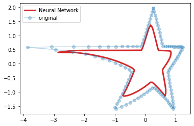
from sklearn.neural_network import MLPRegressor
from sklearn.preprocessing import minmax_scale

H = scale(H)

plt.figure()
f = MLPRegressor(hidden_layer_sizes=(200, 200, 200), alpha=0)
f.fit(H, H)
result = f.predict(H)
plt.plot(result[:,0], result[:,1], 'C3', linewidth=3, label='Neural Network')
plt.plot(H[:,0], H[:,1], 'o', alpha=.3, label='original')
plt.legend()
#plt.xlim([-0.1, 1.1])
#plt.ylim([-0.1, 1.1])
plt.show()


In the snippet above we created a Neural Network with 3 layers of 200 neurons. Then, we trained the model using H as both input and output data. In the chart we compare the original data with the estimation. It's easy to see that there are small differences between the two stars but they are very close.
Here's important to notice that we initialized MLPRegressor using alpha=0. This parameter controls the regularization of the model and the higher its value, the more regularization we apply. To understand how alpha affects the learning of the model we need to add a term to the computation of the error that was just introduced:


where W is a matrix of all the weights in the network. The error not only takes in account the difference between the ouput of the function and the data, but also the size of weights of the connections of the network. Hence, the higher alpha, the less the model is free to learn. If we set alpha to 20 in our experiment we have the following result:


We still achie an approximation of the star but the output of our model is smaller than before and the edges of the star are smoother.
Increasing alpha gradually is a good way to understand the effects of regularization:
from matplotlib.animation import FuncAnimation
from IPython.display import HTML

fig, ax = plt.subplots()
ln, = plt.plot([], [], 'C3', linewidth=3, label='Neural Network')
plt.plot(H[:,0], H[:,1], 'o', alpha=.3, label='original')
plt.legend()

def update(frame):
    f = MLPRegressor(hidden_layer_sizes=(200, 200, 200), alpha=frame)
    f.fit(H, H)
    result = f.predict(H)
    ln.set_data(result[:,0], result[:,1])
    plt.title('alpha = %.2f' % frame)
    return ln,

ani = FuncAnimation(fig, update, frames=np.linspace(0, 40, 100), blit=True)
HTML(ani.to_html5_video())


Here we vary alpha from 0 to 40 and plot the result for each value. We notice here that not only the star gets smaller and smoother as alpha increases but also that the network tends to preserve long lines as much as possible getting away from the edges which account less on error function. Finally we see that the result degenerates into a point when alpha is too high.

Tuesday, October 13, 2015

Game of Life with Python

The game of life consists of a grid of cells where each cell can be dead or alive and the state of the cells can change at each time step. The state of a cell at the time step t depends on the state of the grid at time t-1 and it is determined with a very simple rule:

A cell is alive if it's already alive and has two living neighbours, or if it has three live neighbours.

We call the grid universe and the alive cells population. At each time step the population evolves and we have a new generation. The evolution of the population is a fascinating process to observe because it can generate an incredible variety of patterns (and also puzzles!).

Implementing the game of life in Python is quite straightforward:
import numpy as np

def life(X, steps):
    """
     Conway's Game of Life.
     - X, matrix with the initial state of the game.
     - steps, number of generations.
    """
    def roll_it(x, y):
        # rolls the matrix X in a given direction
        # x=1, y=0 on the left;  x=-1, y=0 right;
        # x=0, y=1 top; x=0, y=-1 down; x=1, y=1 top left; ...
        return np.roll(np.roll(X, y, axis=0), x, axis=1)

    for _ in range(steps):
        # count the number of neighbours 
        # the universe is considered toroidal
        Y = roll_it(1, 0) + roll_it(0, 1) + roll_it(-1, 0) \
            + roll_it(0, -1) + roll_it(1, 1) + roll_it(-1, -1) \
            + roll_it(1, -1) + roll_it(-1, 1)
        # game of life rules
        X = np.logical_or(np.logical_and(X, Y ==2), Y==3)
        X = X.astype(int)
        yield X
The function life takes in input a matrix X which represents the universe of the game where each cell is alive if its corresponding element has value 1 and dead if 0. The function returns the next steps generations. At each time step the number of neighbours of each cell is counted and the rule of the game is applied. Now we can create an universe with an initial state:
X = np.zeros((40, 40)) # 40 by 40 dead cells

# R-pentomino
X[23, 22:24] = 1
X[24, 21:23] = 1
X[25, 22] = 1
This initial state is known as the R-pentomino. It consists of five living cells organized as shown here (image from Wikipedia)

It is by far the most active polyomino with fewer than six cells, all of the others stabilize in at most 10 generations. Let's create a video to visualize the evolution of the system:
from matplotlib import pyplot as plt
import matplotlib.animation as manimation

FFMpegWriter = manimation.writers['ffmpeg']
metadata = dict(title='Game of life', artist='JustGlowing')
writer = FFMpegWriter(fps=10, metadata=metadata)

fig = plt.figure()
fig.patch.set_facecolor('black')
with writer.saving(fig, "game_of_life.mp4", 200):
    plt.spy(X)
    plt.axis('off')
    writer.grab_frame()
    plt.clf()
    for x in life(X, 800):
        plt.spy(x)
        plt.axis('off')
        writer.grab_frame()
        plt.clf()
The result is as follows:


In the video we can notice few very well known patters like gliders and blinkers. Also an exploding start at 0:55!

Thursday, March 7, 2013

Insertion Sort animation

To continue the series of animated sorting algorithm this time we will deal with the Insertion Sort. We are still in the basic algorithms and the way it works is pretty simple. It inserts each element of the array into its proper position, leaving progressively larger stretches of the array sorted. What this means in practice is that the sort iterates down an array, and the part of the array already covered is in order; then, the current element of the array is inserted into the proper position at the head of the array while the rest of the elements are moved using the space just vacated by the element inserted. The Python snippet for creating the animation is the following:
def insertionsort_anim(a):
 x = range(len(a))
 for i in range(1,len(a)):
  val = a[i]
  j = i-1
  while j >= 0 and a[j] > val:
   a[j+1] = a[j] # creating the space for the insertion
   j = j-1
  a[j+1] = val # insertion
  pylab.plot(x,a,'k.',markersize=6)
  pylab.savefig("insertionsort/img" + '%04d' % i + ".png")
  pylab.clf()

# running the algorithm
a = range(300)
shuffle(a)
insertionsort_anim(a)
The strategy used to create the video is the usual and we can see the result in the following video:

It's interesting to see that the algorithm forms small subsets of sorted items that tend to join when the number of iteration grows and the holes between the them are filled by the insertion process.

Saturday, March 2, 2013

Bubble Sort visualized

The bubble sort algorithm is one of the simplest sorting methods to implement and in this post we will see that it is also one of the best to visualize. It works by repeatedly exchanging adjacent elements when necessary and stops when no exchanges are required. Thus, smaller elements will "bubble" to the front, (or bigger elements will be "bubbled" to the back). The following snippet is able to visualize the behavior of the bubble sort:
import pylab
from random import shuffle

def bubblesort_anim(a):
 x = range(len(a))
 imgidx = 0
 # bubble sort algorithm
 swapped = True
 while swapped: # until there's no swapping
  swapped = False
  for i in range(len(a)-1):
   if a[i] > a[i+1]:
    a[i+1], a[i] = a[i], a[i+1] # swap
    swapped = True
  pylab.plot(x,a,'k.',markersize=6)
  pylab.savefig("bubblesort/img" + '%04d' % imgidx + ".png")
  pylab.clf() # figure clear
  imgidx = imgidx + 1

# running the algorithm
a = range(300)
shuffle(a)
bubblesort_anim(a)
The snipped is based same technique we have seen to visualize the insertion sort algorithm and to build the animation. At each iteration an image that represents the status of the array is saved to the disk and ffmpeg is used to build a video as showed in the last post. This time the result should be as follows:

The animation is easy on the eyes and we can observe that during the sorting process the smallest elements approach to their correct positions as the bubbles go up in a glass of soda.

Stay tuned to see the animation of the insertion sort algorithm!

Sunday, February 24, 2013

Selection Sort animated

Lately I bumped in the Wikipedia page dedicated to the Selection Sort algorithm and I found an interesting animation that shows its behavior. So I decided to write this post which shows how to recreate that animation using Python.
The idea behind the selection sort is straightforward: at each iteration the unsorted element with the smallest (or largest) value is moved to its proper position in the array. Assume that we wish to sort an array in increasing order. We begin by selecting the lowest element and moving it to the lowest index position. We can do this by swapping the element at the lowest index and the lowest element. We then reduce the effective size of the unsorted items by one element and repeat the process on the smaller unsorted (sub)array. The process stops when the effective number of the unsorted items becomes 1.
Let's see a Python implementation of the selection sort which is able to visualize with a graph the status of the sorting at each iteration:
import pylab

def selectionsort_anim(a):
 x = range(len(a)) 
 for j in range(len(a)-1):
  iMin = j
  for i in range(j+1,len(a)):
   if a[i] < a[iMin]: # find the smallest value
    iMin = i
  if iMin != j: # place the value into its proper location
   a[iMin], a[j] = a[j], a[iMin]
  # plotting
  pylab.plot(x,a,'k.',markersize=6)
  pylab.savefig("selectionsort/img" + '%04d' % j + ".png")
  pylab.clf() # figure clear

# running the algorithm
a = range(300) # initialization of the array
shuffle(a)     # shuffle!
selectionsort_anim(a) # sorting
At each iteration the status of the algorithm is visualized plotting the indexes of the array versus its values. Every plot is saved as an image and we can easily join them as a video using ffmpeg:
$ cd selectionsort # the directory where the images are
$ ffmpeg -qscale 5 -r 20 -b 9600 -i img%04d.png movie.mp4
The result should be as follows

At each frame of the video we can see that the elements on the left form a subset of items already sorted and the rest of the items remain to be sorted. It's nice to see that the number unsorted elements decrease at each iterations while the subset of sorted items grows forming a straight line.

This is just the first of a series of posts about the visualization of sorting algorithms. Stay tuned for the animations of other sorting algorithms!

Friday, September 2, 2011

Eigenvectors animated gif

We have already seen how to make an animation using pylab. In this post we will use a trick proposed here by Alemi to make another animation. The animation we are going to see shows the eigenvectors of a matrix A 2-by-2 and the result of the linear application A*v when v is a vector that lies on the unit circle. Each frame of the animation is generated by the following script:
from pylab import arrow,axis,clf,savefig,plot
from numpy import array,pi,cos,sin,dot
from numpy.linalg import eig

theta = pi/9
R = array([ [cos(theta), -sin(theta)],  # rotation matrix
            [sin(theta), cos(theta)] ])
v = array([0,1]) # y axis versor

A = array([ [3, -1],  # transformation matrix
            [0,  2] ])
eival,eivec = eig(A) # eigen values and eigenvectors

for i in range(18):
 v = dot(R,v) # theta radiants rotation of v
 y = dot(A,v) # transformation
 # current original vector
 arrow(0,0,v[0],v[1], width=0.01, color='b')
 # current resulting vector
 arrow(0,0,y[0],y[1], width=0.01, color='g') 
 # ellipse axis
 arrow(0,0,eival[0]*eivec[0,0],eival[0]*eivec[1,0], width=0.01, color='y') # major
 arrow(0,0,eival[1]*eivec[0,1],eival[1]*eivec[1,1], width=0.01, color='y') # minor
 # 1st eigenvector
 arrow(0,0,eivec[0,0],eivec[1,0], width=0.01, color='r')
 # 2nd eigenvector
 arrow(0,0,eivec[0,1],eivec[1,1], width=0.01, color='r')
 axis([-3.5,3.5,-3.5,3.5])
 savefig('rotation/'+'0'+str(i+1)+'.png') # save the frame
 clf() # figure clear
And the animated gif is created using the command convert in the directory where the frames have been saved:
$ cd rotation
$ convert *.png -delay 50 -layers Optimize anim.gif
The command is provided by the ImageMagick suite available under linux. Click on the following image to see the animation.
The vector v is represented by the blue arrow, A*v is the green arrow, the eigenvectors are the red arrows, and the yellow arrows are the eigenvectors multiplied by the their respective eigenvalues.

Thursday, June 30, 2011

Animation with matplotlib, bringin the Sierpinski triangle to life

Few post ago we have seen how to plot the Sierpinski triangle. This post is an update that shows how to create an animation where at each step a new point of the fractal is plotted:
from numpy import *
import pylab

x = [0, 0];

A = [ [.5, 0], [0, .5] ];
b1 = [0, 0];
b2 = [.5, 0];
b3 = [.25, sqrt(3)/4];

pylab.ion() # animation on

#Note the comma after line. This is placed here because plot returns a list of lines that are drawn.
line, = pylab.plot(x[0],x[1],'m.',markersize=6) 
pylab.axis([0,1,0,1])

data1 = []
data2 = []
iter = 0

while True:
 r = fix(random.rand()*3)
 if r==0:
  x = dot(A,x)+b1
 if r==1:
  x = dot(A,x)+b2
 if r==2:
  x = dot(A,x)+b3
 data1.append(x[0]) 
 data2.append(x[1])
 line.set_xdata(data1)  # update the data
 line.set_ydata(data2)
 pylab.draw() # draw the points again
 iter += 1
 print iter
This is the result: