Thursday, December 29, 2011

Book review: Numpy 1.5 Beginner's Guide

I got the chance to read the book NumPy 1.5 Beginner's Guide written by Ivan Idris and published by Packt Publishing last month. My impression of the book was quite positive. It's a book based on examples, which incrementally introduce all the main features of the library. It is written with a simple language, and it is always easy to understand.


Contents and structure

The organization and flow are good. The ten chapters contain well thought out examples that you can use as building blocks for your scientific computing projects. Every example is structured in this way:
  • An introduction to the problem that the example will solve.
  • The code, commented line by line.
  • The result of the code.
  • A short recap of how the problem has been solved.
  • And, sometimes, a multiple choice question to help the reader to test his own understanding.
There is no attempt at teaching the mathematics behind the examples. Every example is a "how to" that can help you to learn how to use the library and can save hours of searching through the official documentation and more complicated texts.


The chapters 1,2 and 3 contain the starting points to use NumPy. They explain how to install NumPy, how to handle the NumPy arrays and how to use some of the basic mathematical/statistical functions provided by the library. Chapters 4 through 7 cover the basics about handling matrices, how to load and write data, how to write universal functions and cover some of the basic modules that are discussed. Chapter 8 explains how to use the unit test functions provided by NumPy. Finally, chapters 9 and 10 (my favorites!) introduce how to integrate NumPy with Matplotlib and SciPy.

Who is this book for?

This book is aimed at people who know Python and need to start using scientific computing in their programs. It is also suitable for people who use another scientific computing environment, such as Matlab, and want quick-start introduction to NumPy.

Thursday, December 15, 2011

Polar Charts with matplolib

A polar system is a two-dimensional coordinate system, where there are two coordinates: the radial and the angular coordinates. The radial coordinate denotes the point distance from a central point (pole) and the angular coordinate denotes the angle required to reach the point from the 0 degree ray (polar axis). Let's see an example of how to make polar charts with matplotlib:
from pylab import figure,polar,show
from numpy import arange,pi,cos

theta = arange(0, 2, 1./180)*pi # angular coordinates
figure(1)
polar(3*theta, theta/5) # drawing a spiral
figure(2)
polar(theta, cos(4*theta)) # drawing the polar rose
show()
The result of this script consists of two charts. The first with the spiral
and the second with the polar rose

Thursday, December 8, 2011

Lissajous curves

And after the Epitrochoids, we're going to see another family of wonderful figures: The Lissajous curves. The equations that describe these curves are the following


the curves vary with respect the parameter t and their appearance is determined by the ratio a/b and the value of δ.
As usual, I made a snippet to visualize them:
from numpy import sin,pi,linspace
from pylab import plot,show,subplot

a = [1,3,5,3] # plotting the curves for
b = [1,5,7,4] # different values of a/b
delta = pi/2
t = linspace(-pi,pi,300)

for i in range(0,4):
 x = sin(a[i] * t + delta)
 y = sin(b[i] * t)
 subplot(2,2,i+1)
 plot(x,y)

show()
This is the result

Wednesday, December 7, 2011

Waiting for NumPy 1.5 Beginner’s Guide

I'm waiting to receive a copy of NumPy 1.5 Beginner’s Guide. Lately, I have read a sample chapter of the book and I was surprised because it contains a lot of code examples and clearly explains how to use the code and what it means.


I found on the publisher web site that the book is supposed to cover a lot of topics, from the NumPy installation to the integration of NumPy in real scientific computing projects. If the entire book is like the sample chapter, it will be one of my favorite resources about the NumPy. I can't wait to have the book!

Stay tuned for the complete review ;)

Wednesday, November 23, 2011

How to make Bubble Charts with matplotlib

In this post we will see how to make a bubble chart using matplotlib. The snippet that we are going to see was inspired by a tutorial on flowingdata.com where R is used to make a bubble chart that represents some data extracted from a csv file about the crime rates of America by states. I used the dataset provided by flowingdata to create a similar chart with Python. Let's see the code:
from pylab import *
from scipy import *

# reading the data from a csv file
durl = 'http://datasets.flowingdata.com/crimeRatesByState2005.csv'
rdata = genfromtxt(durl,dtype='S8,f,f,f,f,f,f,f,i',delimiter=',')

rdata[0] = zeros(8) # cutting the label's titles
rdata[1] = zeros(8) # cutting the global statistics

x = []
y = []
color = []
area = []

for data in rdata:
 x.append(data[1]) # murder
 y.append(data[5]) # burglary
 color.append(data[6]) # larceny_theft 
 area.append(sqrt(data[8])) # population
 # plotting the first eigth letters of the state's name
 text(data[1], data[5], 
      data[0],size=11,horizontalalignment='center')

# making the scatter plot
sct = scatter(x, y, c=color, s=area, linewidths=2, edgecolor='w')
sct.set_alpha(0.75)

axis([0,11,200,1280])
xlabel('Murders per 100,000 population')
ylabel('Burglaries per 100,000 population')
show()
The following figure is the resulting bubble chart
It shows the number of burglaries versus the number of murders per 100,000 population. Every bubble is a state of America, the size of the bubbles represents the population of the state and the color is the number of larcenies.

Thursday, November 17, 2011

Fun with Epitrochoids

An epitrochoid is a curve traced by a point attached to a circle of radius r rolling around the outside of a fixed circle of radius R, where the point is a distance d from the center of the exterior circle [Ref]. Lately I found the Epitrochoid's parametric equations on wikipedia:


So,I decided to plot them with pylab. This is the script I made
from numpy import sin,cos,linspace,pi
import pylab

# curve parameters
R = 14
r = 1
d = 18

t = linspace(0,2*pi,300)

# Epitrochoid parametric equations
x = (R-r)*cos(t)-d*cos( (R+r)*t / r )
y = (R-r)*sin(t)-d*sin( (R+r)*t / r )

pylab.plot(x,y,'r')
pylab.axis('equal')
pylab.show()
And this is the result
isn't it fashinating? :)

Monday, November 7, 2011

Computing a disparity map in OpenCV

A disparity map contains information related to the distance of the objects of a scene from a viewpoint. In this example we will see how to compute a disparity map from a stereo pair and how to use the map to cut the objects far from the cameras.
The stereo pair is represented by two input images, these images are taken with two cameras separated by a distance and the disparity map is derived from the offset of the objects between them. There are various algorithm to compute a disparity map, the one implemented in OpenCV is the graph cut algorithm. To use it we have to call the function CreateStereoGCState() to initialize the data structure needed by the algorithm and use the function FindStereoCorrespondenceGC() to get the disparity map. Let's see the code:
def cut(disparity, image, threshold):
 for i in range(0, image.height):
  for j in range(0, image.width):
   # keep closer object
   if cv.GetReal2D(disparity,i,j) > threshold:
    cv.Set2D(disparity,i,j,cv.Get2D(image,i,j))

# loading the stereo pair
left  = cv.LoadImage('scene_l.bmp',cv.CV_LOAD_IMAGE_GRAYSCALE)
right = cv.LoadImage('scene_r.bmp',cv.CV_LOAD_IMAGE_GRAYSCALE)

disparity_left  = cv.CreateMat(left.height, left.width, cv.CV_16S)
disparity_right = cv.CreateMat(left.height, left.width, cv.CV_16S)

# data structure initialization
state = cv.CreateStereoGCState(16,2)
# running the graph-cut algorithm
cv.FindStereoCorrespondenceGC(left,right,
                          disparity_left,disparity_right,state)

disp_left_visual = cv.CreateMat(left.height, left.width, cv.CV_8U)
cv.ConvertScale( disparity_left, disp_left_visual, -16 );
cv.Save( "disparity.pgm", disp_left_visual ); # save the map

# cutting the object farthest of a threshold (120)
cut(disp_left_visual,left,120)

cv.NamedWindow('Disparity map', cv.CV_WINDOW_AUTOSIZE)
cv.ShowImage('Disparity map', disp_left_visual)
cv.WaitKey()
These are the two input image I used to test the program (respectively left and right):
Result using threshold = 100

Thursday, November 3, 2011

Face and eyes detection in OpenCV

The goal of object detection is to find an object of a pre-defined class in an image. In this post we will see how to use the Haar Classifier implemented in OpenCV in order to detect faces and eyes in a single image. We are going to use two trained classifiers stored in two XML files:
  • haarcascade_frontalface_default.xml - that you can find in the directory /data/haarcascades/ of your OpenCV installation
  • haarcascade_eye.xml - that you can download from this website.
The first one is able to detect faces and the second one eyes. To use a trained classifier stored in a XML file we need to load it into memory using the function cv.Load() and call the function cv.HaarDetectObjects() to detect the objects. Let's see the snippet:
imcolor = cv.LoadImage('detectionimg.jpg') # input image
# loading the classifiers
haarFace = cv.Load('haarcascade_frontalface_default.xml')
haarEyes = cv.Load('haarcascade_eye.xml')
# running the classifiers
storage = cv.CreateMemStorage()
detectedFace = cv.HaarDetectObjects(imcolor, haarFace, storage)
detectedEyes = cv.HaarDetectObjects(imcolor, haarEyes, storage)

# draw a green rectangle where the face is detected
if detectedFace:
 for face in detectedFace:
  cv.Rectangle(imcolor,(face[0][0],face[0][1]),
               (face[0][0]+face[0][2],face[0][1]+face[0][3]),
               cv.RGB(155, 255, 25),2)

# draw a purple rectangle where the eye is detected
if detectedEyes:
 for face in detectedEyes:
  cv.Rectangle(imcolor,(face[0][0],face[0][1]),
               (face[0][0]+face[0][2],face[0][1]+face[0][3]),
               cv.RGB(155, 55, 200),2)

cv.NamedWindow('Face Detection', cv.CV_WINDOW_AUTOSIZE)
cv.ShowImage('Face Detection', imcolor) 
cv.WaitKey()
These images are produced running the script with two different inputs. The first one is obtained from an image that contains two faces and four eyes:
And the second one is obtained from an image that contains one face and two eyes (the shakira.jpg we used in the post about PCA):

Monday, October 24, 2011

Corner Detection with OpenCV

Corner detection is an approach used within computer vision systems to extract certain kinds of features and infer the contents of an image [Ref]. We have seen in the previous post how to perform an edge detection using the Sobel operator. Using the edges, we can define a corner as a point for which there are two dominant and different edge directions in a local neighborhood of the point.
One of the most used tool for corner detection is the Harris Corner Detector operator. OpenCV provide a function that implement this operator. The name of the function is CornerHarris(...) and the corners in the image can be found as the local maxima of the returned image. Let's see how to use it in Python:
imcolor = cv.LoadImage('stairs.jpg')
image = cv.LoadImage('stairs.jpg',cv.CV_LOAD_IMAGE_GRAYSCALE)
cornerMap = cv.CreateMat(image.height, image.width, cv.CV_32FC1)
# OpenCV corner detection
cv.CornerHarris(image,cornerMap,3)

for y in range(0, image.height):
 for x in range(0, image.width):
  harris = cv.Get2D(cornerMap, y, x) # get the x,y value
  # check the corner detector response
  if harris[0] > 10e-06:
   # draw a small circle on the original image
   cv.Circle(imcolor,(x,y),2,cv.RGB(155, 0, 25))

cv.NamedWindow('Harris', cv.CV_WINDOW_AUTOSIZE)
cv.ShowImage('Harris', imcolor) # show the image
cv.SaveImage('harris.jpg', imcolor)
cv.WaitKey()
The following image is the result of the program:
The red markers are the corners found by the OpenCV's function.

Friday, October 14, 2011

Beginning with OpenCV in Python

OpenCV (Open Source Computer Vision) is a library of programming functions for real time computer vision [Ref]. In this post we will see how to use some of the basic functions of OpenCV in Python.

The following code opens an image from the disk, prints some image properties on the console and shows a window that contains the image.
# load and show an image in gray scale
image = cv.LoadImage('ariellek.jpg',cv.CV_LOAD_IMAGE_GRAYSCALE)

# print some image properties
print 'Depth:',image.depth,'# Channels:',image.nChannels
print 'Size:',image.width,image.height
print 'Pixel values average',cv.Avg(image)

# create the window
cv.NamedWindow('my window', cv.CV_WINDOW_AUTOSIZE)
cv.ShowImage('my window', image) # show the image
cv.WaitKey() # the window will be closed with a (any)key press
This is the image I used for this example.
And this is what the script showed on the console:
Depth: 8 # Channels: 1
Size: 366 550
Pixel values average (80.46735717834079, 0.0, 0.0, 0.0)
Now we can resize the image loaded above:
# resize the image
dst = cv.CreateImage((150,150), 8, 1)
cv.Resize(image,dst,interpolation=cv.CV_INTER_LINEAR)
cv.ShowImage('my window', dst)
cv.WaitKey()
cv.SaveImage('image2.jpg', dst) # save the image
And this is the result.
A Sobel operator can be applied as follow:
# Sobel operator
dstSobel = cv.CreateMat(image.height, image.width, cv.CV_32FC1)
cv.Sobel(image,dstSobel,1,1,3)
cv.ShowImage('my window', dstSobel)
cv.WaitKey()
cv.SaveImage('imageSobel.jpg', dstSobel)
And this is the result on the picture that I'm using:
The final example below uses two operation, a smoothing filter and a subtraction. It applies a Gaussian Blur to the original image and subtracts the result of the filtering from the original image.
# image smoothing and subtraction
imageBlur = cv.CreateImage(cv.GetSize(image), image.depth, image.nChannels)
# filering the original image
cv.Smooth(image, imageBlur, cv.CV_BLUR, 15, 15)
diff = cv.CreateImage(cv.GetSize(image), image.depth, image.nChannels)
# subtraction (original - filtered)
cv.AbsDiff(image,imageBlur,diff)
cv.ShowImage('my window', diff)
cv.WaitKey()
cv.SaveImage('imageDiff.jpg', diff)
The final output is:

Thursday, October 6, 2011

The Perceptron

In the field of pattern classification, the purpose of a classifier is to use the object's characteristics to identify which class it belongs to. The Perceptron is a classifier and it is one of the simplest kind of Artificial Neural Network. In this post we will see a Python implementation of the Perceptron. The code that we will see implements the schema represented below.


In this schema, an object (pattern) is represented by a vector x and its characteristics (features) are represented by the vector's elements x_1 and x_2. We call the vector w, with elements w_1 and w_2, the weights vector. The values x_1 and x_2 are the input of the Perceptron. When we activate the Perceptron each input is multiplied by the respective weight and then summed. This produces a single value that it is passed to a threshold step function. The output of this function is the output of the Perceptron. The threshold step function has only two possible output: 1 and -1. Hence, when it is activated his reponse indicates that x belong to the first class (1) or the second (-1).

A Perceptron can be trained and we have to guide his learning. In order to train the Perceptron we need something that the Perceptron can imitate, this data is called train set. So, the perceptron learns as follow: an input pattern is shown, it produces an output, compares the output to what the output should be, and then adjusts its weights. This is repeated until the Perceptron converges to the correct behavior or a maximum number of iteration is reached.

The following Python class implements the Percepron using the Rosenblatt training algorithm.
from pylab import rand,plot,show,norm

class Perceptron:
 def __init__(self):
  """ perceptron initialization """
  self.w = rand(2)*2-1 # weights
  self.learningRate = 0.1

 def response(self,x):
  """ perceptron output """
  y = x[0]*self.w[0]+x[1]*self.w[1] # dot product between w and x
  if y >= 0:
   return 1
  else:
   return -1

 def updateWeights(self,x,iterError):
  """
   updates the weights status, w at time t+1 is
       w(t+1) = w(t) + learningRate*(d-r)*x
   where d is desired output and r the perceptron response
   iterError is (d-r)
  """
  self.w[0] += self.learningRate*iterError*x[0]
  self.w[1] += self.learningRate*iterError*x[1]

 def train(self,data):
  """ 
   trains all the vector in data.
   Every vector in data must have three elements,
   the third element (x[2]) must be the label (desired output)
  """
  learned = False
  iteration = 0
  while not learned:
   globalError = 0.0
   for x in data: # for each sample
    r = self.response(x)    
    if x[2] != r: # if we have a wrong response
     iterError = x[2] - r # desired response - actual response
     self.updateWeights(x,iterError)
     globalError += abs(iterError)
   iteration += 1
   if globalError == 0.0 or iteration >= 100: # stop criteria
    print 'iterations',iteration
    learned = True # stop learning
Perceptrons can only classify data when the two classes can be divided by a straight line (or, more generally, a hyperplane if there are more than two inputs). This is called linear separation. Here is a function that generates a linearly separable random dataset.
def generateData(n):
 """ 
  generates a 2D linearly separable dataset with n samples. 
  The third element of the sample is the label
 """
 xb = (rand(n)*2-1)/2-0.5
 yb = (rand(n)*2-1)/2+0.5
 xr = (rand(n)*2-1)/2+0.5
 yr = (rand(n)*2-1)/2-0.5
 inputs = []
 for i in range(len(xb)):
  inputs.append([xb[i],yb[i],1])
  inputs.append([xr[i],yr[i],-1])
 return inputs
And now we can use the Perceptron. We generate two dataset, the first one is used to train the classifier (train set), and the second one is used to test it (test set):
trainset = generateData(30) # train set generation
perceptron = Perceptron()   # perceptron instance
perceptron.train(trainset)  # training
testset = generateData(20)  # test set generation

# Perceptron test
for x in testset:
 r = perceptron.response(x)
 if r != x[2]: # if the response is not correct
  print 'error'
 if r == 1:
  plot(x[0],x[1],'ob')  
 else:
  plot(x[0],x[1],'or')

# plot of the separation line.
# The separation line is orthogonal to w
n = norm(perceptron.w)
ww = perceptron.w/n
ww1 = [ww[1],-ww[0]]
ww2 = [-ww[1],ww[0]]
plot([ww1[0], ww2[0]],[ww1[1], ww2[1]],'--k')
show()
The script above gives the following result:


The blue points belong to the first class and the red ones belong to the second. The dashed line is the separation line learned by the Perceptron during the training.

Thursday, September 22, 2011

The sampling theorem explained with numpy

The sampling theorem states that a continuous signal x(t) bandlimited to B Hz can be recovered from its samples x[n] = x(n*T), where n is an integer, if T is greater than or equal to 1/(2B) without loss of any information. And we call 2B the Nyquist rate.
Sampling at a rate below the Nyquist rate is called undersampling, it leads to the aliasing effect. Let's observe the aliasing effect with the following script:
from numpy import linspace,cos,pi,ceil,floor,arange
from pylab import plot,show,axis

# sampling a signal badlimited to 40 Hz 
# with a sampling rate of 800 Hz
f = 40;  # Hz
tmin = -0.3;
tmax = 0.3;
t = linspace(tmin, tmax, 400);
x = cos(2*pi*t) + cos(2*pi*f*t); # signal sampling
plot(t, x)

# sampling the signal with a sampling rate of 80 Hz
# in this case, we are using the Nyquist rate.
T = 1/80.0;
nmin = ceil(tmin / T);
nmax = floor(tmax / T);
n = arange(nmin,nmax);
x1 = cos(2*pi*n*T) + cos(2*pi*f*n*T);
plot(n*T, x1, 'bo')

# sampling the signal with a sampling rate of 35 Hz
# note that 35 Hz is under the Nyquist rate.
T = 1/35.0;
nmin = ceil(tmin / T);
nmax = floor(tmax / T);
n = arange(nmin,nmax);
x2 = cos(2*pi*n*T) + cos(2*pi*f*n*T);
plot(n*T, x2, '-r.',markersize=8)

axis([-0.3, 0.3, -1.5, 2.3])
show()
The following figure is the result:
The blue curve is the original signal, the blue dots are the samples obtained with the Nyquist rate and the red dots are the samples obtainde with 35 Hz. It's easy to see that the blue samples are enough to recover the blue curve, while the red ones are not enough to capture the oscillations of the signal.

Wednesday, September 14, 2011

Uncertainty principle and spectrogram with pylab

The Fourier transform does not give any information on the time at which a frequency component occurs. One approach which can give information on the time resolution of the spectrum is the Short Time Fourier Transform (STFT). Here a moving window is applied to the signal and the Fourier transform is applied to the signal within the window as the window is moved [Ref]. The choice of window is very important with respect to the performance of the STFT in practice. Since the STFT is simply applying the Fourier transform to pieces of the time series of interest, a drawback of the STFT is that it will not be able to resolve events if they happen to appear within the width of the window. In this case, the lack of time resolution of the Fourier transform is present. In general, one cannot achieve simultaneous time and frequency resolution because of the Heisenberg uncertain principle. In the field of particle physics, an elementary particle does not have precise position and momentum. The better one determines the position of the particle, the less precisely is know at that time, and vice versa. For signal processing, this rule translates into the fact that a signal does not simultaneously have a precise location in time and precise frequency [Ref].

The library pylab provides the function specgram(...) to compute the spectrogram of a signal using the STFT. The following script uses that function to show the spectrogram of a signal with different windows size:
from scipy.io.wavfile import read,write
from pylab import plot,show,subplot,specgram

# Open the Homer Simpson voice: "Ummm, Crumbled up cookie things."
# from http://www.thesoundarchive.com/simpsons/homer/mcrumble.wav
rate,data = read('mcrumble.wav') # reading

subplot(411)
plot(range(len(data)),data)
subplot(412)
# NFFT is the number of data points used in each block for the FFT
# and noverlap is the number of points of overlap between blocks
specgram(data, NFFT=128, noverlap=0) # small window
subplot(413)
specgram(data, NFFT=512, noverlap=0) 
subplot(414)
specgram(data, NFFT=1024, noverlap=0) # big window

show()
This image is the result:
The pictures shows that changing the number of data points used for each Fourier transform block, the spectrogram loses definition in frequency or in the time.

Thursday, September 8, 2011

Sound Synthesis

Physically, sound is an oscillation of a mechanical medium that makes the surrounding air also oscillate and transport the sound as a compression wave. Mathematically, the oscillations can be described as
where t is the time, and f the frequency of the oscillation. Sound on a computer is a sequence of numbers and in this post we will see how to generate a musical tone with numpy and how to write it to a file wav file. Each musical note vibrates at a particular frequency and the following script contains a function to generate a note (tone(...)), we'll use this function to generate the A tone creating an oscillation with f = 440 Hz.
from scipy.io.wavfile import write
from numpy import linspace,sin,pi,int16
from pylab import plot,show,axis

# tone synthesis
def note(freq, len, amp=1, rate=44100):
 t = linspace(0,len,len*rate)
 data = sin(2*pi*freq*t)*amp
 return data.astype(int16) # two byte integers

# A tone, 2 seconds, 44100 samples per second
tone = note(440,2,amp=10000)

write('440hzAtone.wav',44100,tone) # writing the sound to a file

plot(linspace(0,2,2*44100),tone)
axis([0,0.4,15000,-15000])
show()
Now we can play the file 440hzAtone.wav with an external player. This plot shows a part of the signal generated by the script:
And using the plotSpectrum function defined in a previous post we can verify that 440 Hz is the fundamental frequency of the tone.

Friday, September 2, 2011

Eigenvectors animated gif

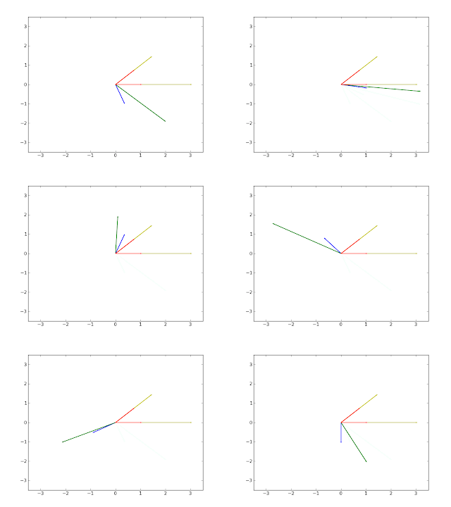
We have already seen how to make an animation using pylab. In this post we will use a trick proposed here by Alemi to make another animation. The animation we are going to see shows the eigenvectors of a matrix A 2-by-2 and the result of the linear application A*v when v is a vector that lies on the unit circle. Each frame of the animation is generated by the following script:
from pylab import arrow,axis,clf,savefig,plot
from numpy import array,pi,cos,sin,dot
from numpy.linalg import eig

theta = pi/9
R = array([ [cos(theta), -sin(theta)],  # rotation matrix
            [sin(theta), cos(theta)] ])
v = array([0,1]) # y axis versor

A = array([ [3, -1],  # transformation matrix
            [0,  2] ])
eival,eivec = eig(A) # eigen values and eigenvectors

for i in range(18):
 v = dot(R,v) # theta radiants rotation of v
 y = dot(A,v) # transformation
 # current original vector
 arrow(0,0,v[0],v[1], width=0.01, color='b')
 # current resulting vector
 arrow(0,0,y[0],y[1], width=0.01, color='g') 
 # ellipse axis
 arrow(0,0,eival[0]*eivec[0,0],eival[0]*eivec[1,0], width=0.01, color='y') # major
 arrow(0,0,eival[1]*eivec[0,1],eival[1]*eivec[1,1], width=0.01, color='y') # minor
 # 1st eigenvector
 arrow(0,0,eivec[0,0],eivec[1,0], width=0.01, color='r')
 # 2nd eigenvector
 arrow(0,0,eivec[0,1],eivec[1,1], width=0.01, color='r')
 axis([-3.5,3.5,-3.5,3.5])
 savefig('rotation/'+'0'+str(i+1)+'.png') # save the frame
 clf() # figure clear
And the animated gif is created using the command convert in the directory where the frames have been saved:
$ cd rotation
$ convert *.png -delay 50 -layers Optimize anim.gif
The command is provided by the ImageMagick suite available under linux. Click on the following image to see the animation.
The vector v is represented by the blue arrow, A*v is the green arrow, the eigenvectors are the red arrows, and the yellow arrows are the eigenvectors multiplied by the their respective eigenvalues.

Thursday, August 25, 2011

How to use ginput

ginput is a function that enables you to select points from a figure using the mouse. This post is a simple example on how to use it.
from pylab import plot, ginput, show, axis

axis([-1, 1, -1, 1])
print "Please click three times"
pts = ginput(3) # it will wait for three clicks
print "The point selected are"
print pts # ginput returns points as tuples
x=map(lambda x: x[0],pts) # map applies the function passed as 
y=map(lambda x: x[1],pts) # first parameter to each element of pts
plot(x,y,'-o')
axis([-1, 1, -1, 1])
show()
And after three clicks this is the result on the console:
Please click three times
The point selected are
[(-0.77468982630272942, -0.3418367346938776), (0.11464019851116632, -0.21428571428571436), (0.420347394540943, 0.55612244897959173)]
and this is the figure generated:


Wednesday, August 10, 2011

Applying a Moebius transformation to an image

The Moebius transformation is defined as
where z is a complex variable different than -d/c. And a, b, c, d are complex numbers.
In this post we will see how to apply the Moebius transform to an image.
Given a set of three distinct points on the complex plane z1, z2, z3 and a second set of distinct points w1, w2, w3, there exists precisely one Moebius transformation f(z) which maps the zs to the ws. So, in the first step we have to determine f(z) from the given sets of points. We will use the explicit determinant formula to compute the coefficients:
from pylab import *
from numpy import *

zp=[157+148j, 78+149j, 54+143j]; # (zs) the complex point zp[i]
wa=[147+143j, 78+140j, 54+143j]; # (ws) will be in wa[i]

# transformation parameters
a = linalg.det([[zp[0]*wa[0], wa[0], 1], 
                [zp[1]*wa[1], wa[1], 1], 
                [zp[2]*wa[2], wa[2], 1]]);

b = linalg.det([[zp[0]*wa[0], wa[0], wa[0]], 
                [zp[1]*wa[1], wa[1], wa[1]], 
                [zp[2]*wa[2], wa[2], wa[2]]]);         

c = linalg.det([[zp[0], wa[0], 1], 
                [zp[1], wa[1], 1], 
                [zp[2], wa[2], 1]]);

d = linalg.det([[zp[0]*wa[0], zp[0], 1], 
                [zp[1]*wa[1], zp[1], 1], 
                [zp[2]*wa[2], zp[2], 1]]);
Now we can apply the transformation to the pixel coordinates.
img = fliplr(imread('mondrian.jpg')) # load an image

r = ones((500,500,3),dtype=uint8)*255 # empty-white image
for i in range(img.shape[0]):
 for j in range(img.shape[1]):
  z = complex(i,j)
  # transformation applied to the pixels coordinates
  w = (a*z+b)/(c*z+d)
  r[int(real(w)),int(imag(w)),:] = img[i,j,:] # copy of the pixel

subplot(1,2,1)
title('Original Mondrian')
imshow(img)
subplot(1,2,2)
title('Mondrian after the transformation')
imshow(roll(r,120,axis=1))
show()
And this is the result.
This is another image obtained changing the vectors zp and wa.
As we can see, the result of the transformation has some empty areas that we should fill using interpolation. So let's look to another way to implement a geometric transformation on an image. The following code uses the scipy.ndimage.geometric_transform to implement the inverse Moebius transform:
from scipy.ndimage import geometric_transform

def shift_func(coords):
 """ Define the moebius transformation, though backwards """
 #turn the first two coordinates into an imaginary number
 z = coords[0] + 1j*coords[1]
 w = (d*z-b)/(-c*z+a) #the inverse mobius transform
 #take the color along for the ride
 return real(w),imag(w),coords[2]
    
r = geometric_transform(img,shift_func,cval=255,output_shape=(450,350,3)) 
It gives the following result:
We can see that the geometric_transform provides the pixel interpolation automatically.


Wednesday, August 3, 2011

How to plot the frequency spectrum with scipy

Spectrum analysis is the process of determining the frequency domain representation of a time domain signal and most commonly employs the Fourier transform. The Discrete Fourier Transform (DFT) is used to determine the frequency content of signals and the Fast Fourier Transform (FFT) is an efficient method for calculating the DFT. Scipy implements FFT and in this post we will see a simple example of spectrum analysis:
from numpy import sin, linspace, pi
from pylab import plot, show, title, xlabel, ylabel, subplot
from scipy import fft, arange

def plotSpectrum(y,Fs):
 """
 Plots a Single-Sided Amplitude Spectrum of y(t)
 """
 n = len(y) # length of the signal
 k = arange(n)
 T = n/Fs
 frq = k/T # two sides frequency range
 frq = frq[range(n/2)] # one side frequency range

 Y = fft(y)/n # fft computing and normalization
 Y = Y[range(n/2)]
 
 plot(frq,abs(Y),'r') # plotting the spectrum
 xlabel('Freq (Hz)')
 ylabel('|Y(freq)|')

Fs = 150.0;  # sampling rate
Ts = 1.0/Fs; # sampling interval
t = arange(0,1,Ts) # time vector

ff = 5;   # frequency of the signal
y = sin(2*pi*ff*t)

subplot(2,1,1)
plot(t,y)
xlabel('Time')
ylabel('Amplitude')
subplot(2,1,2)
plotSpectrum(y,Fs)
show()
The program shows the following figure, on top we have a plot of the signal and on the bottom the frequency spectrum.

Wednesday, July 27, 2011

PCA and image compression with numpy

In the previous post we have seen the princomp function. This function performs principal components analysis (PCA) on the n-by-p data matrix and uses all the p principal component to computed the principal component scores. In this new post, we will see a modified version of the princomp where the representation of the original data in the in the principal component space is computed with less than p principal components:
from numpy import mean,cov,cumsum,dot,linalg,size,flipud

def princomp(A,numpc=0):
 # computing eigenvalues and eigenvectors of covariance matrix
 M = (A-mean(A.T,axis=1)).T # subtract the mean (along columns)
 [latent,coeff] = linalg.eig(cov(M))
 p = size(coeff,axis=1)
 idx = argsort(latent) # sorting the eigenvalues
 idx = idx[::-1]       # in ascending order
 # sorting eigenvectors according to the sorted eigenvalues
 coeff = coeff[:,idx]
 latent = latent[idx] # sorting eigenvalues
 if numpc < p and numpc >= 0:
  coeff = coeff[:,range(numpc)] # cutting some PCs if needed
 score = dot(coeff.T,M) # projection of the data in the new space
 return coeff,score,latent
The following code uses the new version of the princomp to compute the PCA of a matrix that represents an image in gray scale. The PCA is computed ten times with an increasing number of principal components. The script show the images reconstructed using less than 50 principal components (out of 200).
from pylab import imread,subplot,imshow,title,gray,figure,show,NullLocator
A = imread('shakira.jpg') # load an image
A = mean(A,2) # to get a 2-D array
full_pc = size(A,axis=1) # numbers of all the principal components
i = 1
dist = []
for numpc in range(0,full_pc+10,10): # 0 10 20 ... full_pc
 coeff, score, latent = princomp(A,numpc)
 Ar = dot(coeff,score).T+mean(A,axis=0) # image reconstruction
 # difference in Frobenius norm
 dist.append(linalg.norm(A-Ar,'fro'))
 # showing the pics reconstructed with less than 50 PCs
 if numpc <= 50:
  ax = subplot(2,3,i,frame_on=False)
  ax.xaxis.set_major_locator(NullLocator()) # remove ticks
  ax.yaxis.set_major_locator(NullLocator())
  i += 1 
  imshow(flipud(Ar))
  title('PCs # '+str(numpc))
  gray()

figure()
imshow(flipud(A))
title('numpc FULL')
gray()
show()
The resulting images:


We can see that 40 principal components are enough to reconstruct the original image.


At the end of this experiment, we can plot the distance of the reconstructed images from the original image in Frobenius norm (red curve) and the cumulative sum of the eigenvalues (blue curve). Recall that the cumulative sum of the eigenvalues shows the level of variance accounted by each of the corresponding eigenvectors. On the x axis there is the number of eigenvalues/eigenvectors used.
from pylab import plot,axis
figure()
perc = cumsum(latent)/sum(latent)
dist = dist/max(dist)
plot(range(len(perc)),perc,'b',range(0,full_pc+10,10),dist,'r')
axis([0,full_pc,0,1.1])
show()

Friday, July 22, 2011

Principal Component Analysis with numpy

The following function is a three-line implementation of the Principal Component Analysis (PCA). It is inspired by the function princomp of the matlab's statistics toolbox.
from numpy import mean,cov,double,cumsum,dot,linalg,array,rank
from pylab import plot,subplot,axis,stem,show,figure

def princomp(A):
 """ performs principal components analysis 
     (PCA) on the n-by-p data matrix A
     Rows of A correspond to observations, columns to variables. 

 Returns :  
  coeff :
    is a p-by-p matrix, each column containing coefficients 
    for one principal component.
  score : 
    the principal component scores; that is, the representation 
    of A in the principal component space. Rows of SCORE 
    correspond to observations, columns to components.
  latent : 
    a vector containing the eigenvalues 
    of the covariance matrix of A.
 """
 # computing eigenvalues and eigenvectors of covariance matrix
 M = (A-mean(A.T,axis=1)).T # subtract the mean (along columns)
 [latent,coeff] = linalg.eig(cov(M)) # attention:not always sorted
 score = dot(coeff.T,M) # projection of the data in the new space
 return coeff,score,latent
(In this other post you can find an updated version of this function).
In the following test a 2D dataset wil be used. The result of this test is a plot with the two principal components (dashed lines), the original data (blue dots) and the new data (red stars). As we expected the first principal component describes the direction of maximum variance and the second is orthogonal to the first.
A = array([ [2.4,0.7,2.9,2.2,3.0,2.7,1.6,1.1,1.6,0.9],
            [2.5,0.5,2.2,1.9,3.1,2.3,2,1,1.5,1.1] ])

coeff, score, latent = princomp(A.T)

figure()
subplot(121)
# every eigenvector describe the direction
# of a principal component.
m = mean(A,axis=1)
plot([0, -coeff[0,0]*2]+m[0], [0, -coeff[0,1]*2]+m[1],'--k')
plot([0, coeff[1,0]*2]+m[0], [0, coeff[1,1]*2]+m[1],'--k')
plot(A[0,:],A[1,:],'ob') # the data
axis('equal')
subplot(122)
# new data
plot(score[0,:],score[1,:],'*g')
axis('equal')
show()

In this second example princomp(.) is tested on a 4D dataset. In this example the matrix of the data is rank deficient and only the first two components are necessary to bring the information of the entry dataset.
A = array([[-1, 1, 2, 2],
           [-2, 3, 1, 0],
           [ 4, 0, 3,-1]],dtype=double)

coeff, score, latent = princomp(A)
perc = cumsum(latent)/sum(latent)
figure()
# the following plot shows that first two components 
# account for 100% of the variance.
stem(range(len(perc)),perc,'--b')
axis([-0.3,4.3,0,1.3])
show()
print 'the principal component scores'
print score.T # only the first two columns are nonzero
print 'The rank of A is'
print rank(A)  # indeed, the rank of A is 2

Coefficients for principal components
[[  1.464140e+00   1.588382e+00   0.000000e+00  -4.440892e-16]
 [  2.768170e+00  -1.292503e+00  -2.775557e-17   6.557254e-16]
 [ -4.232310e+00  -2.958795e-01   1.110223e-16  -3.747002e-16]]
The rank of A is
2

Monday, July 18, 2011

Jukowsi Transformation

The following code applies the Jukowsi transformation to various circles on the complex plane.
from pylab import plot,show,axis,subplot
import cmath
from numpy import *

def cplxcircm(radius,center):
 """Returns an array z where every z[i] is a point 
    on the circle's circumference on the complex plane"""
 teta = linspace(0,pi*2,150)
 z = []
 for a in teta:
  # rotating of radius+0j of a radians and translation
  zc = (radius+0j)*cmath.exp(complex(0,a)) - center
  z.append(zc)
 return array( z, dtype=complex )

def jukowsi(z,L):
 return z+L/z # asimmetric Jukowski transformation

# let's try the transformation on three different circles
subplot(131)
z = cplxcircm(1,complex(0.5,0)) #1st circle
w = jukowsi(z,1) # applying the trasformation
plot(real(z),imag(z),'b',real(w),imag(w),'r')
axis('equal')

subplot(132)
z = cplxcircm(0.8,complex(0.4,0.3))
w = jukowsi(z,0.188) 
plot(real(z),imag(z),'b',real(w),imag(w),'r')
axis('equal')

subplot(133)
z = cplxcircm(1.1,complex(0.1,0.0))
w = jukowsi(z,1)
plot(real(z),imag(z),'b',real(w),imag(w),'r')
axis('equal')
show()
The script shows the following figure. Every subplot shows two curves on the complex plane (x real values, y imaginary values), the blue curve is the starting curve and the red is the transformation.

Thursday, July 14, 2011

Polynomial curve fitting

We have seen already how to a fit a given set of points minimizing an error function, now we will see how to find a fitting polynomial for the data using the function polyfit provided by numpy:
from numpy import *
import pylab

# data to fit
x = random.rand(6)
y = random.rand(6)

# fit the data with a 4th degree polynomial
z4 = polyfit(x, y, 4) 
p4 = poly1d(z4) # construct the polynomial 

z5 = polyfit(x, y, 5)
p5 = poly1d(z5)

xx = linspace(0, 1, 100)
pylab.plot(x, y, 'o', xx, p4(xx),'-g', xx, p5(xx),'-b')
pylab.legend(['data to fit', '4th degree poly', '5th degree poly'])
pylab.axis([0,1,0,1])
pylab.show()

Let's see the two polynomials:

Tuesday, July 12, 2011

Dice rolling experiment

If we roll a die a large number of times, and we compute the mean and variance, as exaplained here, we’d expect to obtain a mean = 3.5 and a variance = 2.916. Let's simulate that with a script:
import pylab
import math
 
# Rolling the die 1000 times
v = pylab.randint(1,7,size=(1000))

print 'mean',pylab.mean(v)
print 'variance',pylab.var(v)

pylab.hist(v, bins=6) # histogram of the outcoming
pylab.xlim(1,6)
pylab.show()
Here's the result:
mean 3.435
variance 2.781775

Monday, July 11, 2011

Prime factor decomposition of a number

The following function compute the prime factors (PFs) of an integer.
from math import floor

def factors(n):
 result = []
 for i in range(2,n+1): # test all integers between 2 and n
  s = 0;
  while n/i == floor(n/float(i)): # is n/i an integer?
   n = n/float(i)
   s += 1
  if s > 0:
   for k in range(s):
    result.append(i) # i is a pf s times
   if n == 1:
    return result

# test
print factors(90)
The result will be
[2, 3, 3, 5]
This means that 90 is equal to 2*3*3*5.

Wednesday, July 6, 2011

How to use reflection

A simple code snippet that use reflection to print names of attributes, methods and doc strings:
class Obj:
 """ An object that use reflection """

 def __init__(self,name):
  """ the constructor of this object """
  self.name = name

 def print_methods(self):
  """ print all the methods of this object and their doc string"""
  print '\n* Methods *'
  for names in dir(self):
   attr = getattr(self,names)
   if callable(attr):
    print names,':',attr.__doc__

 def print_attributes(self):
  """ print all the attributes of this object and their value """
  print '* Attributes *'
  for names in dir(self):
   attr = getattr(self,names)
   if not callable(attr):
    print names,':',attr

 def print_all(self):
  """ calls all the methods of this object """
  for names in dir(self):
   attr = getattr(self,names)
   if callable(attr) and names != 'print_all' and names != '__init__':
    attr() # calling the method

o = Obj('the my object')
o.print_all()
Which gives the following output:
* Attributes *
__doc__ :  An object that use reflection 
__module__ : __main__
name : the my object

* Methods *
__init__ :  the constructor of this object 
print_all :  calls all the methods of this object 
print_my_attributes :  print all the attributes of this object 
print_my_methods :  print all the methods of this object 

Monday, July 4, 2011

How to plot biorhythm

The following script plot the biorhythm of a person born in 14/3/1988 in a range of 20 days.
from datetime import date
import matplotlib.dates
from pylab import *
from numpy import array,sin,pi

t0 = date(1988,3,14).toordinal()
t1 = date.today().toordinal()
t = array(range((t1-10),(t1+10))) # range of 20 days

y = 100*[sin(2*pi*(t-t0)/23),  # Physical
         sin(2*pi*(t-t0)/28),  # Emotional
         sin(2*pi*(t-t0)/33)]; # Intellectual

# converting ordinals to date
label = []
for p in t:
 label.append(date.fromordinal(p))

fig = figure()
ax = fig.gca()
plot(label,y[0],label,y[1],label,y[2])
# adding a legend
legend(['Physical', 'Emotional', 'Intellectual'])
# formatting the dates on the x axis
ax.xaxis.set_major_formatter(matplotlib.dates.DateFormatter('%d/%b'))

show()
The resulting graph:

Friday, July 1, 2011

Approximating pi

This script uses the following formula
to approximate the value of pi with a fixed number of correct digits.
import math
def pi(digits):
 k = 0
 pi = 0.0
 e = 1.0
 tol = pow(10,-digits) # is minimum error that we want to accept
 while e > tol:
  pi_old = pi
  pi += (2*pow(-1,k)*pow(3,.5-k))/(2*k+1)
  e = abs(pi-pi_old) # current error
  k += 1
  print '%0.16f %20.16f' % (pi,e)
 print '\nerror',e,'\niterations ',k
 print '%0.16f' % pi,'result'
 print '%0.16f' % math.pi,'real pi'

pi(8) # approximating pi with 8 correcet digits
During the execution you can see the current approximated value on the left column and the difference with the approximation at the previous step on the right column. At the end, the difference between the approximated value and the value provided by the math python module will be printed.
$ python pi.py 
3.4641016151377544   3.4641016151377544
3.0792014356780038   0.3849001794597506
3.1561814715699539   0.0769800358919501
3.1378528915956800   0.0183285799742738
3.1426047456630846   0.0047518540674045
3.1413087854628832   0.0012959602002014
3.1416743126988376   0.0003655272359544
3.1415687159417840   0.0001055967570536
3.1415997738115058   0.0000310578697218
3.1415905109380802   0.0000092628734256
3.1415933045030817   0.0000027935650015
3.1415924542876463   0.0000008502154354
3.1415927150203800   0.0000002607327336
3.1415926345473140   0.0000000804730660
3.1415926595217138   0.0000000249743999
3.1415926517339976   0.0000000077877162

error 7.78771624965e-09 
iterations  16
3.1415926517339976 result
3.1415926535897931 real pi

Thursday, June 30, 2011

Animation with matplotlib, bringin the Sierpinski triangle to life

Few post ago we have seen how to plot the Sierpinski triangle. This post is an update that shows how to create an animation where at each step a new point of the fractal is plotted:
from numpy import *
import pylab

x = [0, 0];

A = [ [.5, 0], [0, .5] ];
b1 = [0, 0];
b2 = [.5, 0];
b3 = [.25, sqrt(3)/4];

pylab.ion() # animation on

#Note the comma after line. This is placed here because plot returns a list of lines that are drawn.
line, = pylab.plot(x[0],x[1],'m.',markersize=6) 
pylab.axis([0,1,0,1])

data1 = []
data2 = []
iter = 0

while True:
 r = fix(random.rand()*3)
 if r==0:
  x = dot(A,x)+b1
 if r==1:
  x = dot(A,x)+b2
 if r==2:
  x = dot(A,x)+b3
 data1.append(x[0]) 
 data2.append(x[1])
 line.set_xdata(data1)  # update the data
 line.set_ydata(data2)
 pylab.draw() # draw the points again
 iter += 1
 print iter
This is the result:

Tuesday, June 28, 2011

Searching for IP address using regular expression

This snippet finds an IP address in a string using regex:
import re
ip = re.compile('(([2][5][0-5]\.)|([2][0-4][0-9]\.)|([0-1]?[0-9]?[0-9]\.)){3}'
                +'(([2][5][0-5])|([2][0-4][0-9])|([0-1]?[0-9]?[0-9]))')

match = ip.search("Your ip address is 192.168.0.1, have fun!")
if match:
 print 'IP address found:',
 print match.group(), # matching substring
 print 'at position',match.span() # indexes of the substring found
else:
 print 'IP address not found'
The output will be
IP address found: 192.168.0.1 at position (19, 30)

Thursday, June 9, 2011

Crawling the web with SGMLParser

In this example we will use SGMLParser in order to build a simple web crawler.
import urllib
from random import choice
from sgmllib import SGMLParser

class LinkExplorer(SGMLParser): 
 def reset(self):                              
  SGMLParser.reset(self) 
  self.links = [] # list with the urls

 def start_a(self, attrs):
  """ fill the links with the links in the page """
  for k in attrs:
   if k[0] == 'href' and k[1].startswith('http'): 
    self.links.append(k[1])

def explore(parser,s_url,maxvisit=10,iter=0):
 """ pick a random link in the page s_url
     and follow its links recursively """
 if iter < maxvisit: # it will stop after maxvisit iteration
  print '(',iter,') I am in',s_url
  usock = urllib.urlopen(s_url) # download the page
  parser.reset() # reset the list
  parser.feed(usock.read()) # parse the current page
  if len(parser.links) > 0:
   explore(parser,choice(parser.links),maxvisit,iter+1)
  else: # if the page has no links to follow
   print 'the page has no links'

# test the crawler starting from the python's website
parser = LinkExplorer()
explore(parser,"http://www.python.org/")
Let's go!
( 0 ) I am in http://www.python.org/
( 1 ) I am in http://wiki.python.org/moin/NumericAndScientific
( 2 ) I am in http://numpy.scipy.org/
( 3 ) I am in http://sphinx.pocoo.org/
( 4 ) I am in http://www.bitbucket.org/birkenfeld/sphinx/issues/
( 5 ) I am in http://blog.bitbucket.org
( 6 ) I am in http://haproxy.1wt.eu/
( 7 ) I am in http://www.olivepeak.com/blog/posts/read/free-your-port-80-with-haproxy
( 8 ) I am in http://www.olivepeak.com/peaknotes/
( 9 ) I am in http://notes.olivepeak.com/account/create

Tuesday, June 7, 2011

Sierpinski fractal

As described in the introduction of Numerical Computing in Matlab we can generate fractals using affine transformations. The following script uses it to generate the famous Sierpinski triangle:
from numpy import *
import pylab

x = [0, 0];

A = [ [.5, 0], [0, .5] ];
b1 = [0, 0];
b2 = [.5, 0];
b3 = [.25, sqrt(3)/4];

for i in range(3000): # 3000 points will be generated
 r = fix(random.rand()*3)
 if r==0:
  x = dot(A,x)+b1
 if r==1:
  x = dot(A,x)+b2
 if r==2:
  x = dot(A,x)+b3
 pylab.plot(x[0],x[1],'m.',markersize=2)

pylab.show()
It will take a while, here's the result

Friday, June 3, 2011

The Collatz conjecture

The Collatz conjecture is a famous unsolved problem in number theory. Start with any
positive integer n. Repeat the following steps:
  • If n = 1, stop.
  • If n is even, replace it with n/2.
  • If n is odd, replace it with 3n + 1

The unanswered question is, does the process always terminate?

Let to see a script that generate the sequence of number involved by the algorithm:

import sys
from pylab import *

# take n from the command line
n = int(sys.argv[1])

i = 0
old_n = n
while n > 1:
 if n%2 == 0: # if n is even
  n = n/2
 else:
  n = 3*n+1
 i += 1;
 plot([i-1, i],[old_n,n],'-ob')
 old_n = n

title('hailstone sequence for '+sys.argv[1]+', length is '+str(i))
show()
The script will plot the sequence:
$ python collatz.py 25

The Collatz conjecture is is also known as the 3n + 1 conjecture, the Ulam conjecture, Kakutani's problem, the Thwaites conjecture, Hasse's algorithm, or the Syracuse problem; the sequence of numbers involved is referred to as the hailstone sequence or hailstone numbers, or as wondrous numbers.

References

Thursday, June 2, 2011

Integration of a function using quad from scipy

Example of integration of a function using scipy:
from scipy.integrate import quad

f = lambda x: 4-x*x # function to integrate
p = lambda x: (-x*x*x)/3 + 4*x # the primitive of f

# let's try to integrate f in the interval [0 2]
r = quad(f,0,2)   # integration using quad
r_analytic = p(2.0)-p(0.0) # analytic integration

print 'Results'
print r[0]
print r_analytic
Numerical and analytic result compared:
Results
5.33333333333
5.33333333333

Saturday, May 28, 2011

Data fitting using fmin

We have seen already how to find the minimum of a function using fmin, in this example we will see how use it to fit a set of data with a curve minimizing an error function:
from pylab import *
from numpy import *
from numpy.random import normal
from scipy.optimize import fmin

# parametric function, x is the independent variable
# and c are the parameters.
# it's a polynomial of degree 2
fp = lambda c, x: c[0]+c[1]*x+c[2]*x*x
real_p = rand(3)

# error function to minimize
e = lambda p, x, y: (abs((fp(p,x)-y))).sum()

# generating data with noise
n = 30
x = linspace(0,1,n)
y = fp(real_p,x) + normal(0,0.05,n)

# fitting the data with fmin
p0 = rand(3) # initial parameter value
p = fmin(e, p0, args=(x,y))

print 'estimater parameters: ', p
print 'real parameters: ', real_p

xx = linspace(0,1,n*3)
plot(x,y,'bo', xx,fp(real_p,xx),'g', xx, fp(p,xx),'r')

show()
The following figure will be showed, in green the original curve used to generate the noisy data, in blue the noisy data and in red the curve found in the minimization process:

The parameters will be printed also:
Optimization terminated successfully.
         Current function value: 0.861885
         Iterations: 77
         Function evaluations: 146
estimater parameters:  [ 0.92504602  0.87328979  0.64051926]
real parameters:  [ 0.86284356  0.95994753  0.67643758]

Friday, May 27, 2011

Delaunay triangulation with matplotlib

How to plot the delaunay triangulation for a set of points in the plane using matplotlib:
import matplotlib.delaunay as triang
import pylab
import numpy

# 10 random points (x,y) in the plane
x,y =  numpy.array(numpy.random.standard_normal((2,10)))
cens,edg,tri,neig = triang.delaunay(x,y)

for t in tri:
 # t[0], t[1], t[2] are the points indexes of the triangle
 t_i = [t[0], t[1], t[2], t[0]]
 pylab.plot(x[t_i],y[t_i])

pylab.plot(x,y,'o')
pylab.show()
The output will be similar to this:

Wednesday, May 25, 2011

Pickling: How to serialize objects

There is an example on how to serialize and de-serialize python objects.
import pickle
import random

print 'Write data...'
output = open('mydata.pkl', 'wb')
for i in range(0,5): # writing five lists on the file
 list = random.sample(range(0,100),10) # random integers list
 print 'saving:',list
 pickle.dump(list, output)
output.close()

print 'Load data...'
input = open("mydata.pkl","rb") # open the file in reading mode
try:
 while True: # load from the file until EOF is reached
  list = pickle.load(input)
  print 'loaded: ',list
except EOFError:
  print 'End of file reached'
input.close()
This is the output:
Write data...
saving: [15, 10, 85, 65, 17, 31, 19, 2, 68, 44]
saving: [96, 2, 27, 90, 99, 66, 31, 97, 51, 12]
saving: [82, 61, 12, 49, 50, 84, 91, 83, 23, 89]
saving: [83, 28, 85, 75, 14, 68, 96, 58, 5, 66]
saving: [55, 73, 1, 24, 29, 92, 58, 96, 41, 10]
Load data...
loaded:  [15, 10, 85, 65, 17, 31, 19, 2, 68, 44]
loaded:  [96, 2, 27, 90, 99, 66, 31, 97, 51, 12]
loaded:  [82, 61, 12, 49, 50, 84, 91, 83, 23, 89]
loaded:  [83, 28, 85, 75, 14, 68, 96, 58, 5, 66]
loaded:  [55, 73, 1, 24, 29, 92, 58, 96, 41, 10]
End of file reached

Monday, May 23, 2011

Four ways to compute the Google Pagerank

As described in THE $25,000,000,000 EIGENVECTOR THE LINEAR ALGEBRA BEHIND GOOGLE, we can compute the score of a page on a web as the maximal eigenvector of the matrix

Google

where A is the scaled connectivity matrix of a web, S is an n × n matrix with all entries 1/n and m is a real number between 0 and 1.

Here's implemented four ways to compute the maximal eigenvector of the matrix using the numpy:
from numpy import *

def powerMethodBase(A,x0,iter):
 """ basic power method """
 for i in range(iter):
  x0 = dot(A,x0)
  x0 = x0/linalg.norm(x0,1)
 return x0

def powerMethod(A,x0,m,iter):
 """ power method modified to compute
     the maximal real eigenvector 
     of the matrix M built on top of the input matrix A """
 n = A.shape[1]
 delta = m*(array([1]*n,dtype='float64')/n) # array([1]*n is [1 1 ... 1] n times
 for i in range(iter):
  x0 = dot((1-m),dot(A,x0)) + delta
 return x0

def maximalEigenvector(A):
 """ using the eig function to compute eigenvectors """
 n = A.shape[1]
 w,v = linalg.eig(A)
 return abs(real(v[:n,0])/linalg.norm(v[:n,0],1))

def linearEquations(A,m):
 """ solving linear equations 
     of the system (I-(1-m)*A)*x = m*s """
 n = A.shape[1]
 C = eye(n,n)-dot((1-m),A)
 b = m*(array([1]*n,dtype='float64')/n)
 return linalg.solve(C,b)

def getTeleMatrix(A,m):
 """ return the matrix M
     of the web described by A """
 n = A.shape[1]
 S = ones((n,n))/n
 return (1-m)*A+m*S

A = array([ [0,     0,     0,     1, 0, 1],
            [1/2.0, 0,     0,     0, 0, 0],
            [0,     1/2.0, 0,     0, 0, 0],
            [0,     1/2.0, 1/3.0, 0, 0, 0],
            [0,     0,     1/3.0, 0, 0, 0],
            [1/2.0, 0,     1/3.0, 0, 1, 0 ] ])

n = A.shape[1] # A is n x n
m = 0.15
M = getTeleMatrix(A,m)

x0 = [1]*n
x1 = powerMethod(A,x0,m,130)
x2 = powerMethodBase(M,x0,130)
x3 = maximalEigenvector(M)
x4 = linearEquations(A,m)

# comparison of the four methods
labels = range(1,6)
print array([labels, x1, x2, x3, x4]).T

The matrix A used to the test the program describe the following web


The scores are (the first column show the labels):
[[ 1.          0.32954577  0.32954577  0.32954577  0.32954577]
 [ 2.          0.16505695  0.16505695  0.16505695  0.16505695]
 [ 3.          0.0951492   0.0951492   0.0951492   0.0951492 ]
 [ 4.          0.12210815  0.12210815  0.12210815  0.12210815]
 [ 5.          0.05195894  0.05195894  0.05195894  0.05195894]
 [ 6.          0.23618099  0.23618099  0.23618099  0.23618099]]